A blog by Yesim Cetin
I am a graphic design student at London Metropolitan University, currently transitioning into my final year, and this project was part of a live brief developed in collaboration with the Liliesleaf Trust UK. The brief asked us to design exhibition graphics for a speculative exhibition marking the 70th anniversary of the Freedom Charter – a historic document central to South Africa’s struggle for democracy. Drafted by 1955 through a process of mass participation, it stands as a manifesto by the people, for the people – articulating a vision of equality, justice, and shared freedom that laid the foundation for the democratic constitution that would follow decades later.
The exhibition was aimed at secondary school students and challenged us to consider how graphic design can communicate historical values, political heritage, and democratic ideals through visual language. Key considerations included clarity, accessibility, and age-appropriate design, alongside sensitivity to the historical significance of the subject matter.
When I first began working on this project, I immediately felt a sense of responsibility. As a designer and a parent of a nine-year-old, I’m very aware of how quickly young audiences can lose focus, especially in today’s fast-paced digital world. My goal was to create something visually engaging while remaining respectful of the Charter’s historical weight. A conversation with my son, who already knew a surprising amount about apartheid, reminded me just how aware and capable children can be. That moment gave me both direction and hope for how this exhibition could inform and inspire.
Design Thinking & Inspiration
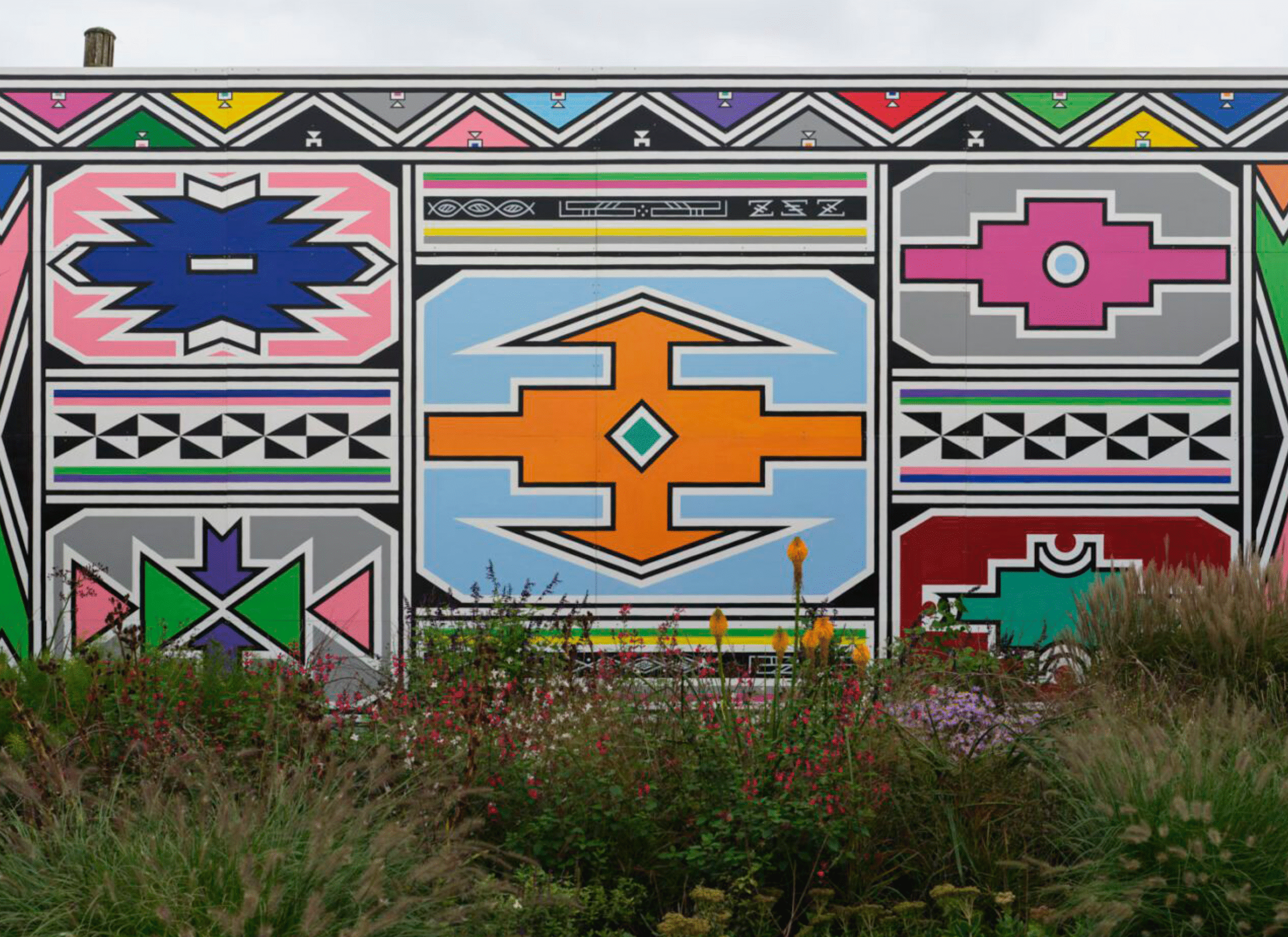
The exhibition’s visual direction was guided by the keywords bold, inviting, and engaging. As I began my research, I focused on contemporary South African artists to gain a deeper understanding of the cultural context of the Freedom Charter. That’s when I came across Esther Mahlangu’s work. Her use of vibrant colour, symmetry, and geometric symbolism – traditionally painted by women on the walls of their homes – deeply resonated with me. These forms carry meaning, rooted in identity, pride, and community.
As a woman, I was especially moved by Mahlangu’s powerful presence in the art world. Incorporating her visual language into the design also felt like a personal shout-out to the women who stood tall within the Freedom Charter’s vision for justice. It was a quiet tribute to the women who have shaped both art and activism.


Figure 1: Esther Mahlangu, Umuntu ngumuntu ngabantu, 2024. Serpentine North Garden, 4 October 2024 – 28 September 2025. Courtesy Serpentine and The Melrose Gallery. Photo: George Darrell. Source: serpentinegalleries.org
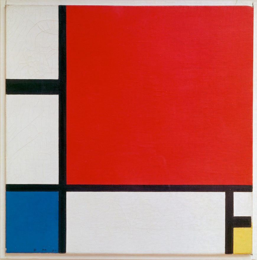
Figure 2: Piet Mondrian, Composition with Red, Blue, and Yellow, 1930, oil on canvas, 46 x 46 cm (Kunsthaus Zürich). © 2014 Mondrian/Holtzman Trust c/o HCR International USA. Source: smarthistory.org
Visually, Mahlangu’s expressive patterns reminded me of Mondrian’s structured compositions and use of bold, balanced colour fields. Although they come from vastly different contexts, both artists employ abstraction and structure to convey ideas – a quality I also saw reflected in the Freedom Charter itself. Mondrian’s radical approach to form and balance, often interpreted as a metaphor for social and spiritual harmony, felt like a conceptual parallel to the Charter’s call for a just society.
Blending these influences helped me establish a visual language that felt expressive yet grounded. This led to a modular layout using blocks of colour and soft gradients to add warmth and rhythm. Clearly defined sections supported wayfinding and guided the visitor’s movement through the space.
I wanted to create an environment that communicated historical content without overwhelming the viewer, something readable, emotionally open, and visually accessible. Instead of relying on a traditional museum format, I aimed for a more contemporary visual tone, where structure and symbolism could work together to support both engagement and understanding.
Setting the Mood Through Colour & Type
The colour palette was based on a warm-toned gradient I came across during early research. It felt immersive and welcoming — a tone I carried through the exhibition to establish an emotionally open atmosphere.
Typography reinforced this tone. Pack Hard was used for headers — a bold, geometric typeface that introduced structure and emphasis — while Inter supported clarity and legibility in body text. Together, they communicated confidence without overwhelming the content.
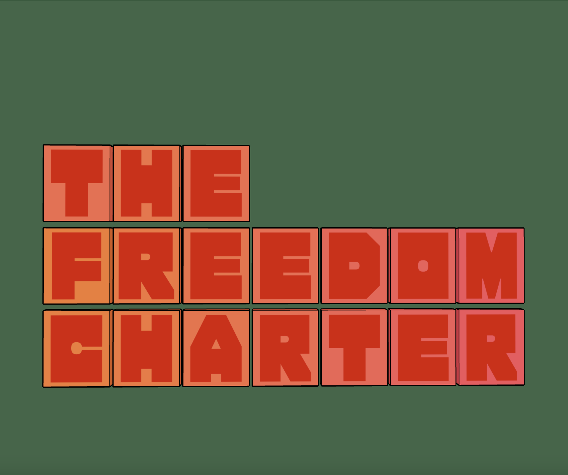
Figure 4: Title graphic panel using the warm-toned gradient and modular blocks to create an inviting first impression.
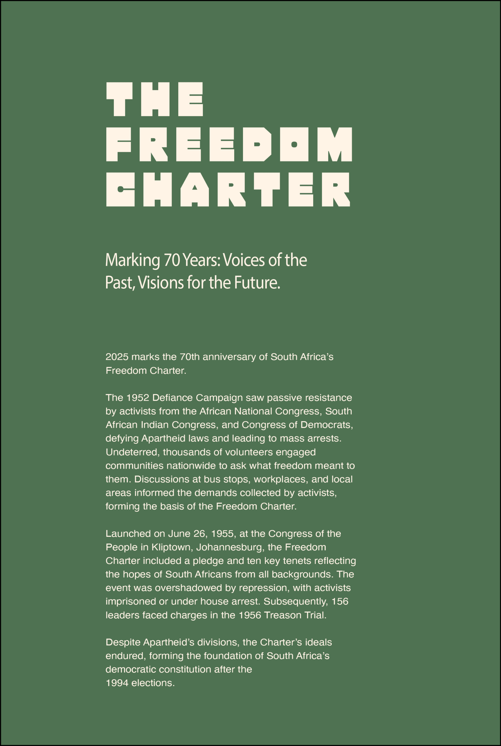
Figure 3: Introductory panel showing the typographic hierarchy; Pack Hard for headers, Inter for body text.
Mapping History Visually
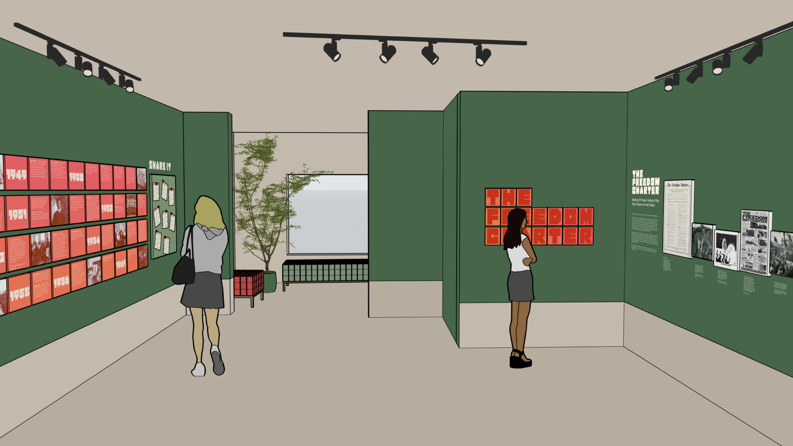
The timeline adhered to the same visual principles: a modular grid, a warm gradient palette, and a clear type hierarchy. Events were cleanly separated and paired with supporting visuals, helping anchor each historical moment, from the Defiance Campaign to the Treason Trial, key moments in the trajectory of the Freedom Charter’s journey. To guide the eye naturally, information was laid out left to right. Tighter spacing was used in denser sections, while more breathing space was left toward the bottom to ease the flow.
On the opposite side, the artefact wall showcased the Freedom Charter at a larger scale, presented in visual harmony with the other artefacts yet distinguished as the exhibition’s central and defining feature.
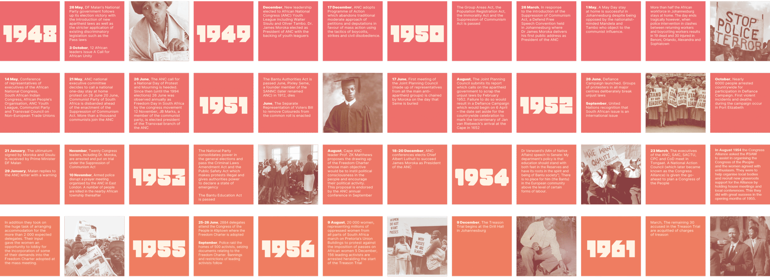
Figure 5: Full view of the timeline, using a block-based grid to highlight key historical events from 1948 to 1961.
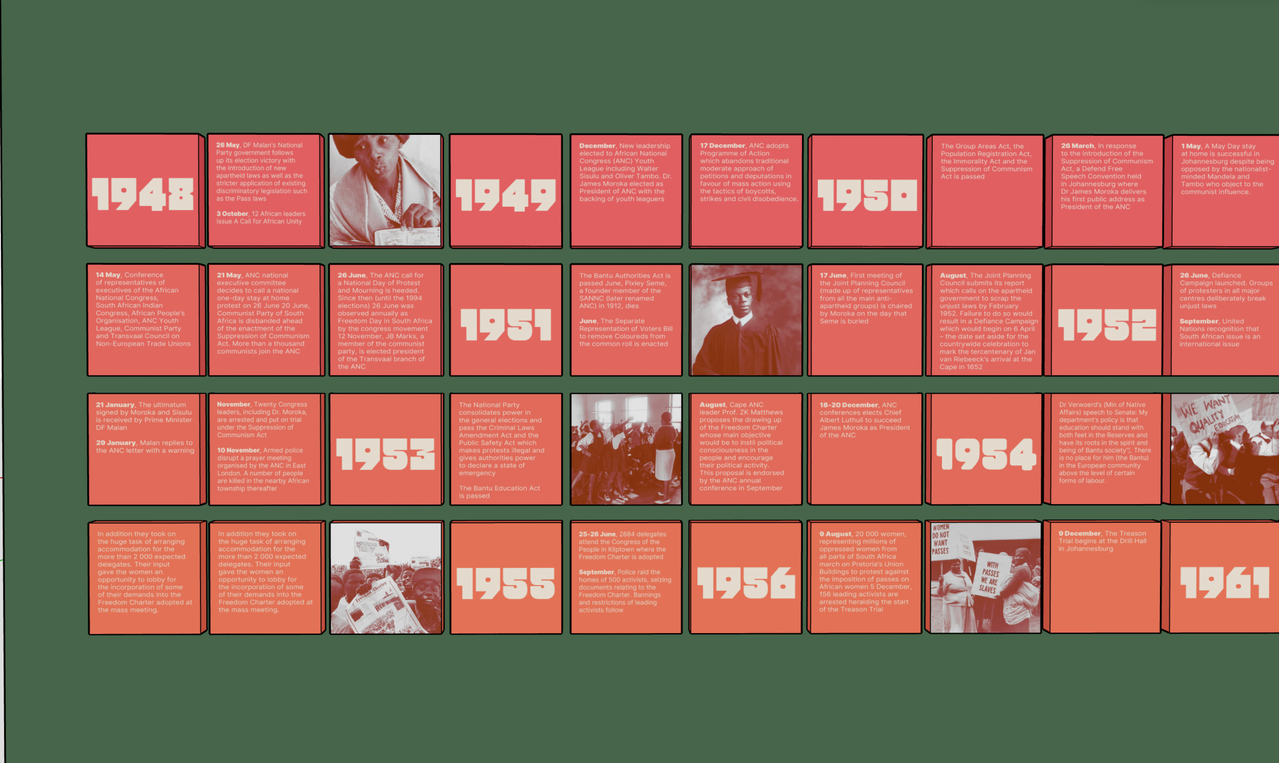
Figure 6: Mock-up of the installed timeline, featuring left-to-right flow, clear separation, and warm colour blocks for readability
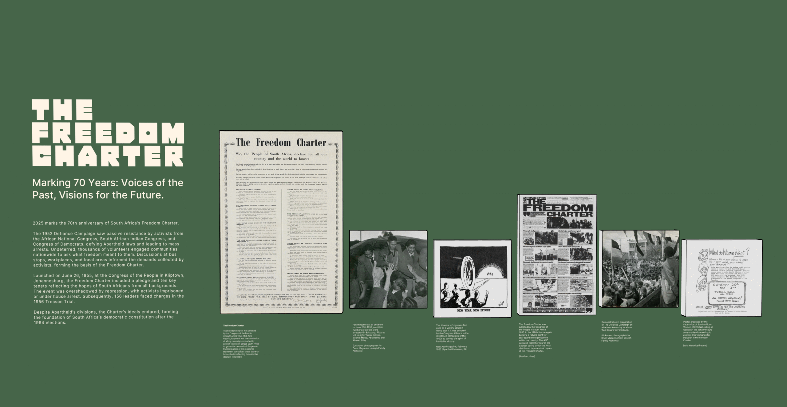
Figure 6: Mock-up of the installed timeline, featuring left-to-right flow, clear separation, and warm colour blocks for readability
Inviting Participation
One of the exhibition’s key interactive elements was a worksheet designed to resemble binding paper, referencing how the original Freedom Charter was compiled with contributions from across South African society. Visitors could tear off a sheet; on the back, they were invited to write their own Freedom Charter for 2025. His concept added a participatory layer to the exhibition, encouraging students to reflect on democratic values in their own words.
Figure 8: Front side of the worksheet: Each sheet displays one letter from the modular exhibition title.
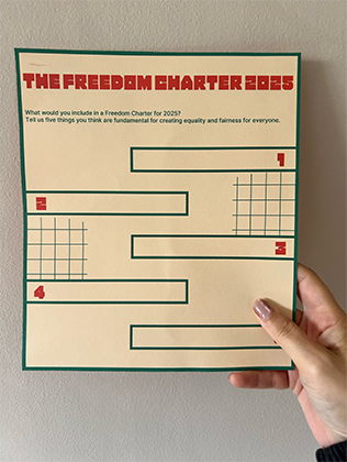
Figure 9: Back side of the worksheet: Invites visitors to write their own Freedom Charter for 2025.

Figure 10: “Share It” wall mock-up displaying completed worksheets – encouraging participation and reflection.
Tactility & Structure
Material choices helped shape the physical tone of the exhibition. MDF boards were used for the timeline and artefact panels, chosen for their simplicity and durability. The worksheets were printed on binding-style paper to mirror the document’s original form, while corkboards displayed visitor responses, adding a tactile and personal dimension to the space.

Figure 11: MDF board selected as the main surface material for the timeline and artefact panels.

Figure 12: Corkboard used for the interactive “Share It” wall, enhancing texture and accessibility.
Poster Design as Visual Anchor
A poster was developed to express the exhibition’s visual identity in a standalone format, incorporating warm gradients, archival imagery, and a modular layout structure.
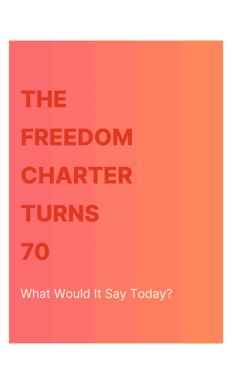
Figure 13: Poster design featuring warm gradients and clear, accessible typography — inviting public reflection on the Charter’s legacy.
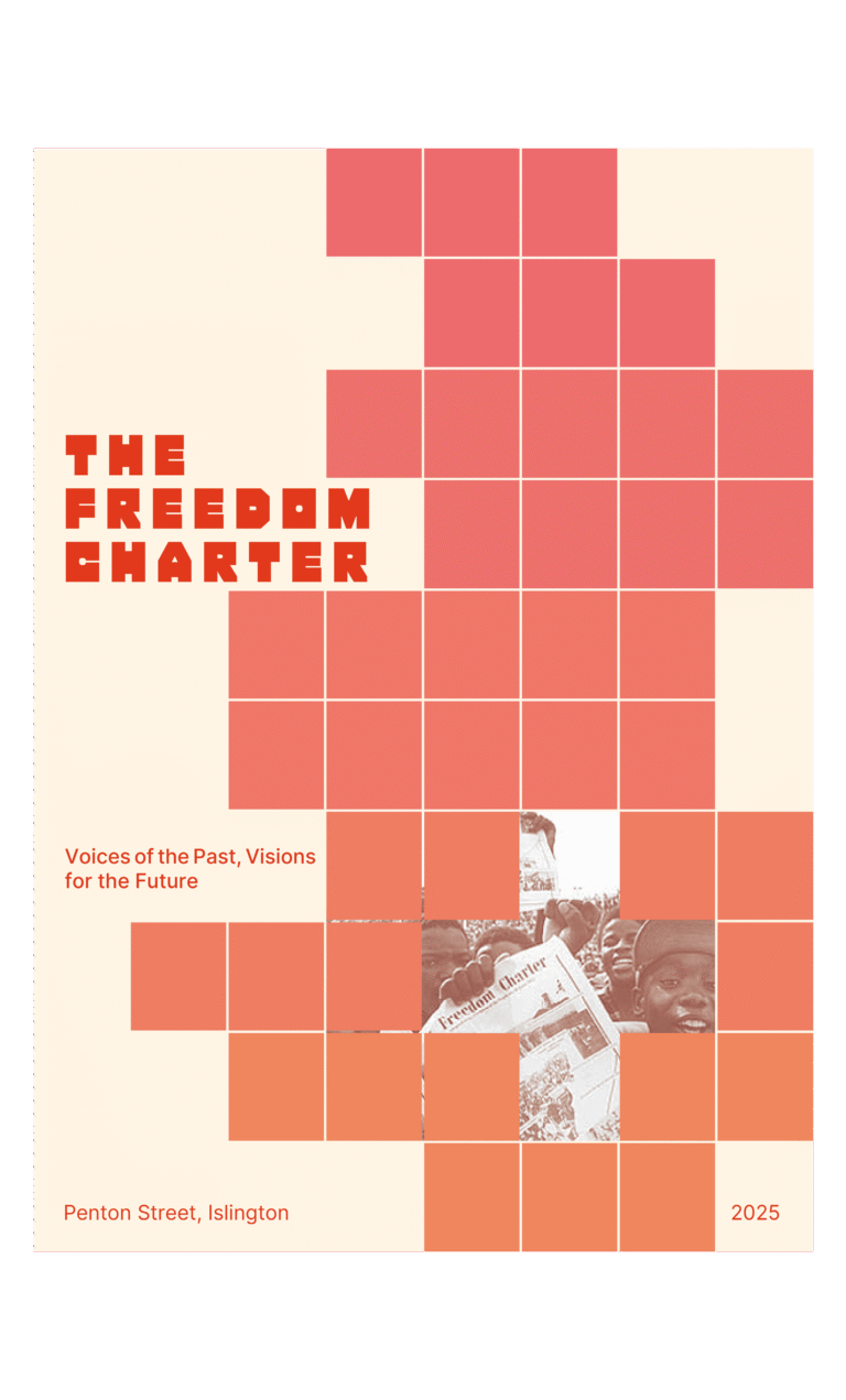
Figure 14: Poster design combining archival imagery and a modular layout to visually bridge past and present.
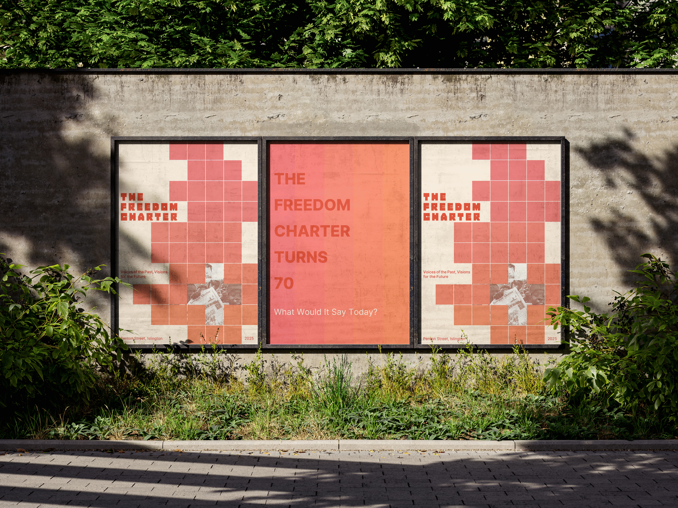
Figure 15: Final poster mock-up in an urban context—showing how visual identity translates beyond the exhibition space.
Reflections on Process & Purpose
This exhibition wasn’t just about looking back, it was also about imagining forward. Through bold visuals, participatory design, and considered references, the goal was to create a space where the values and tenets of the Freedom Charter could continue to inspire reflection, conversation, and action – not as a relic of the past, but as a living document guiding our collective pursuit of justice, equality, and dignity in the present and future.
Being part of this collaboration between London Metropolitan University and the Liliesleaf Trust UK’s Anti-Apartheid Legacy Centre has been a meaningful experience. Contributing to a project that honours such a vital document and helping reintroduce it to a new generation has been both a privilege and a point of pride.
This project also strengthened my understanding of how graphic design can serve as a tool for civic education, opening space for learning, dialogue, and imaginative engagement with history.
As a student, a parent, and a designer, this project reminded me that design is not only about aesthetics or function, it’s also about care, responsibility, and the stories we choose to tell.
Click the image to watch the full exhibition walkthrough on YouTube.
Sharing the Work
This project marks a significant milestone in my creative journey, and I am pleased to share it with you through this blog. Documenting the process allows me to connect with others and reflect on how design can foster dialogue around history and education.
You can find me on Instagram: @yesim.visuals
You can also reach me via email: yesim.visuals@gmail.com