Reframing the Soweto Uprising for a New Generation
A blog by Jaydon Thamotharampillay, June 2026
Hello, I’m a Level 5 Graphic Design student that studies at London Metropolitan University. I recently took part in a 12-week live brief that became a memorable and meaningful experience.
The Soweto Uprising. Then. Now. Next.
Soweto Uprising: Then. Now. Next – Speculative Exhibition Mock-up
The Brief
The Anti-Apartheid Legacy Centre wanted us to design a visual identity for a speculative physical exhibition on the topic of the Soweto Uprising. The formats and materials were decided by us, and the target audience set by the Centre, was secondary school children. We researched the struggle for democracy and the history of Apartheid, particularly the Soweto Uprising in 1976.
Through this research, I learned that the Soweto Uprising was not only a protest against Afrikaans being imposed in schools, but also a powerful example of young people challenging injustice. Thousands of students took to the streets to demand a better future, and their actions became a turning point in the struggle against apartheid. Understanding this history made me think about how young people today can use their own voices to influence change in their communities.
Thinking about the target audience was not difficult for me, as I was part of that age group only a few years ago. I also have a younger cousin in secondary school, which helped me think about the kinds of content and platforms young people engage with today. Social media, especially TikTok, YouTube and Instagram, plays a big role in how they discover, discuss and share ideas, making it an important space to consider when designing this exhibition.
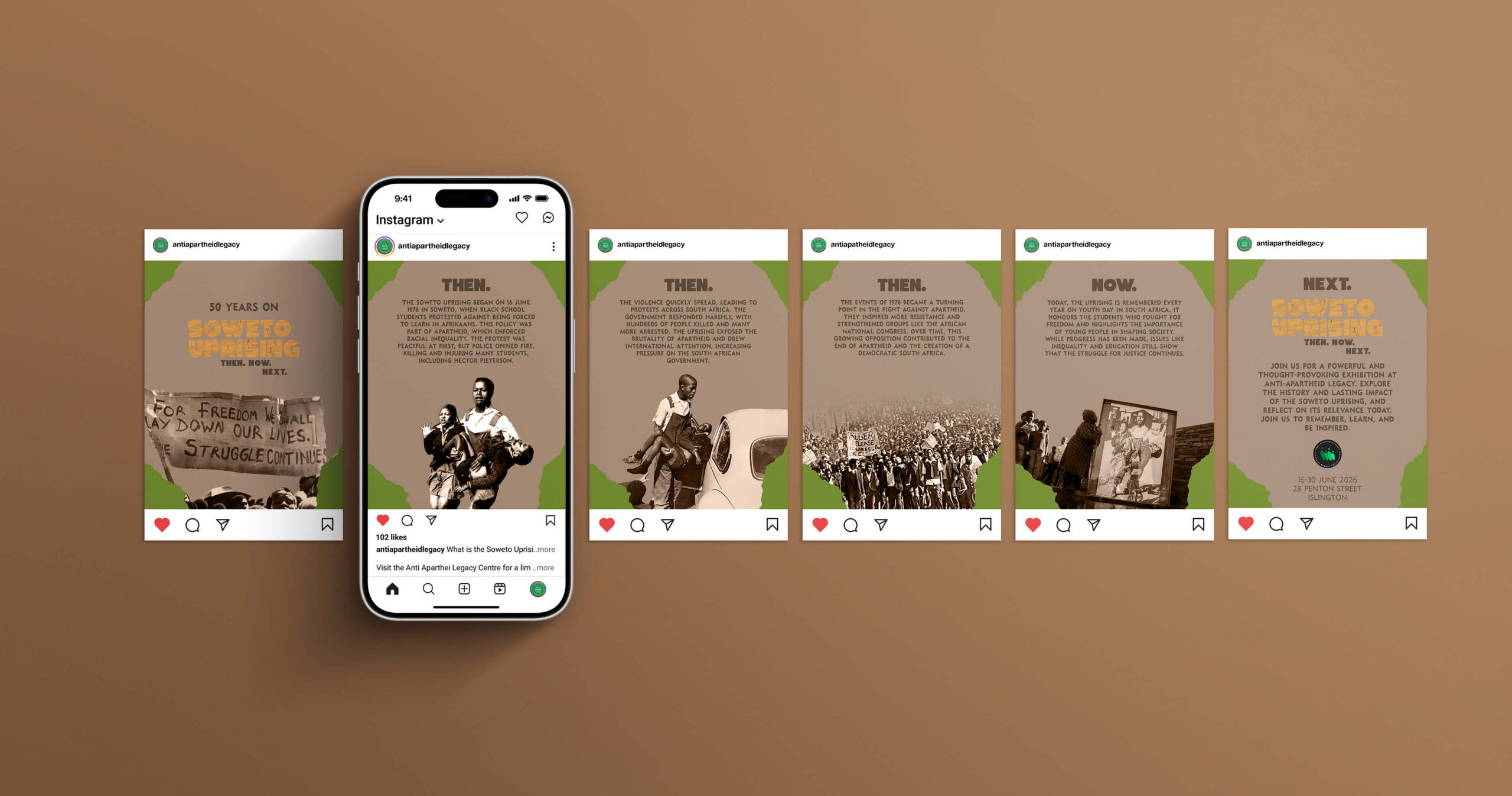
Instagram Carousel post mockup. My design process was informed by archival research, including photographs by South African photographers such as Alf Kumalo, Peter Magubane and Sam Nzima, accessed through, amongst others the Photography Legacy Project archive. These images gave me a stronger understanding of the visual language of protest and helped shape the textures, compositions and emotional tone of the exhibition identity.
Because many of the students involved in the Soweto Uprising were the same age as the intended audience, young people may feel a stronger connection to their stories. Seeing their bravery can encourage reflection on the role young people have played in shaping society, both in the past and today. Rather than viewing the uprising as distant history, the exhibition invites visitors to consider what they can learn from these events and how they might help shape the future.
Idea Generation & Design Thought Process
My concept for this exhibition was shaped by three keywords that reflect the Soweto Uprising: defiant, irregular and intense. I wanted to promote learning as well as create a sense of suspense for the visitor.
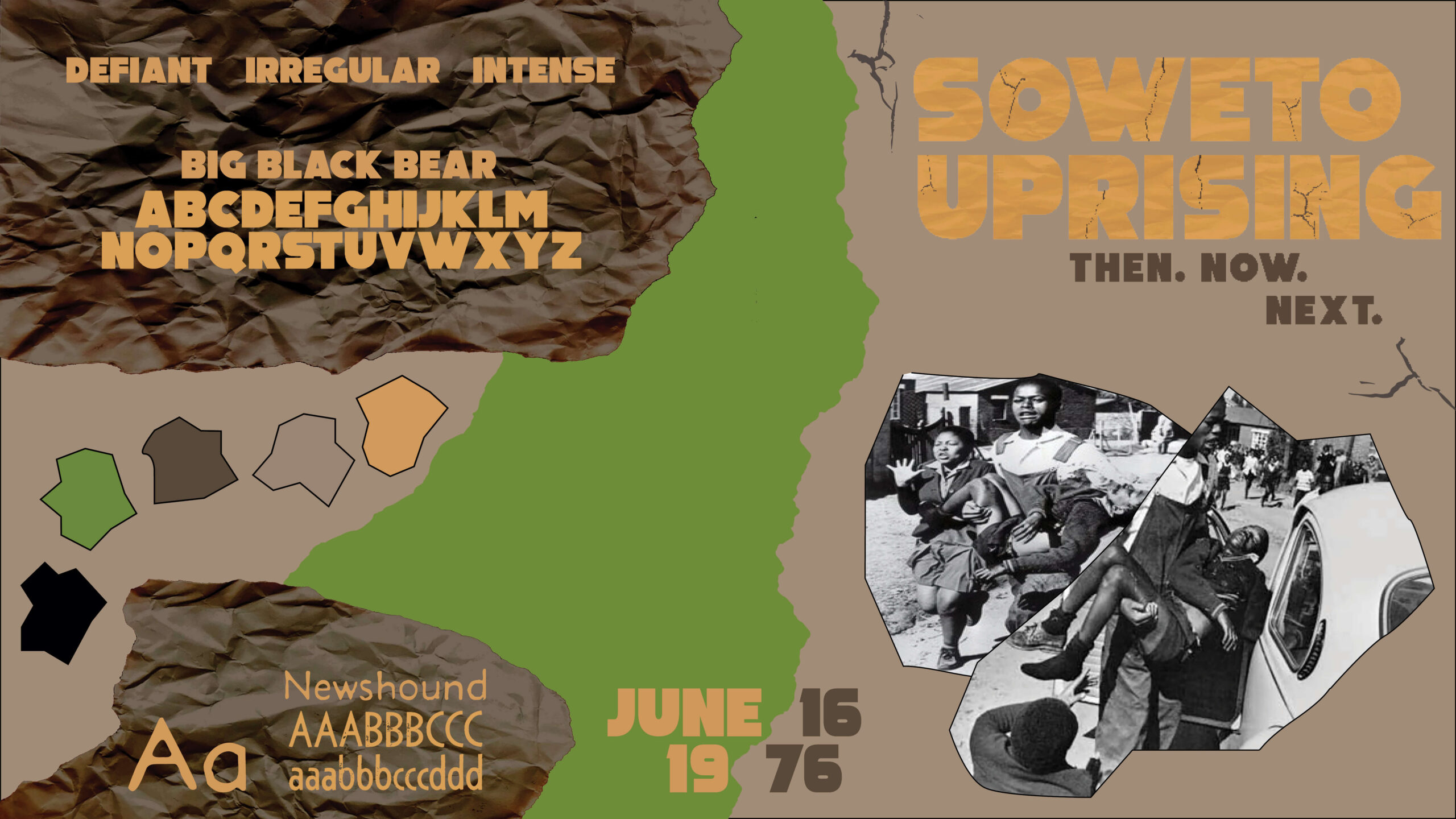
I created this stylescape to express my concept, inspired in part by iconic photographs taken by Sam Nzima in June 1976.
The design concept for the exhibition was to highlight the Soweto Uprising through the use of cracks and textures in a range of printed and 2D materials, to express the irreversible marks that history leaves. This reflects the lives of children lost during what began as a peaceful protest, leaving a permanent mark on South African history and on the families affected. At the same time, I wanted the exhibition to communicate resilience and collective action. The Soweto Uprising is remembered not only because of the violence that followed, but because it demonstrated the power of young people standing together to challenge an unjust system.
The colour palette combines earthy tones with contrasting yellow and black to reflect both the South African landscape and the intensity of the uprising. Inspired by the natural world, the palette creates a grounded and personal atmosphere while also drawing on the strength and resilience found in nature. The deeper browns and greens hint at land, place and division, while the sharper yellow and black introduce a sense of danger, disruption and loss. Together, these colours help communicate both the violence of the event and the enduring strength of the young people who stood against injustice.
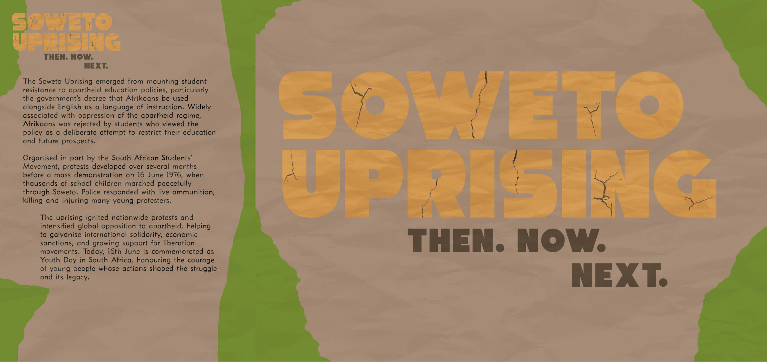
Intro Panel & Title Graphic created for the speculative exhibition.
To express the boldness and urgency of the uprising, I used the typeface ‘Big Black Bear’ for a thick, headline font to grab the viewer’s attention and ‘Newshound’ for a more rough and harsh contrasting font, used for body copy text. During my research, I found similar typefaces used in Soweto Uprising posters, further supporting my graphic style.
The Soweto Uprising logotype itself was crafted with thought and precision. The cracks inside the lettering represent the damage caused by police violence and the lasting impact of the uprising. The positioning of Then. Now. Next. reflects the exhibition’s central idea: to connect past struggles with present realities and encourage visitors to think about the future.
The captions follow the same visual language, using consistent textures, colours and typefaces to create a cohesive identity while maintaining clarity and accessibility for visitors.
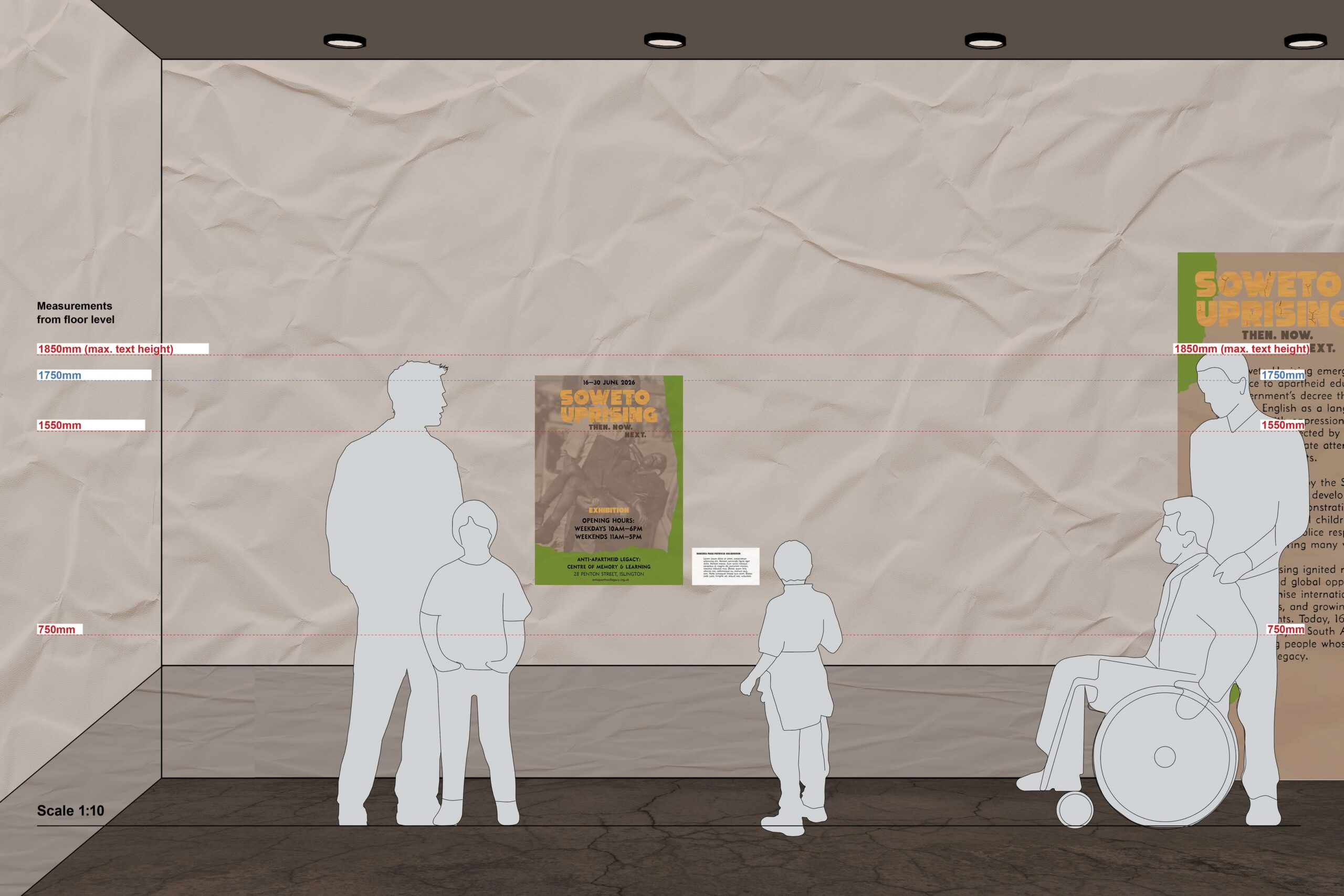
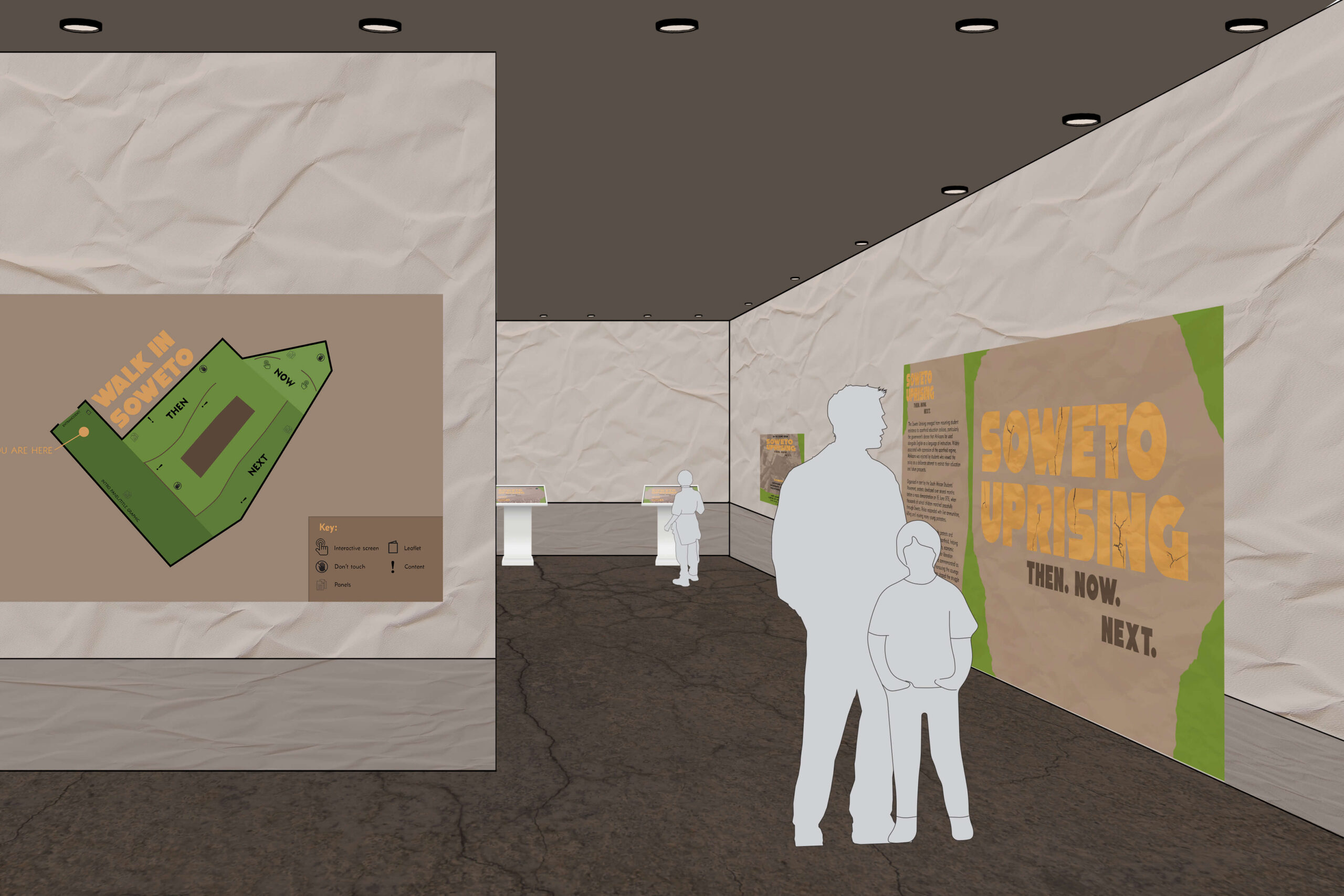
Example caption in speculative exhibition (overview at 1:10 scale).
In my intro panel, I continued the same visual language and type layout used throughout the exhibition to create consistency. I also introduced the land textures seen across the wider identity, helping to strengthen the connection between the exhibition’s themes and its visual design. By combining the title graphic and intro panel, I created a strong introduction that allows visitors to immediately engage with both the exhibition’s identity and the historical context of the Soweto Uprising.
My intention was for visitors to immediately understand that this exhibition is not only about what happened in 1976, but why it still matters today. The “Then. Now. Next.” structure encourages reflection on historical events, their lasting impact, and the lessons they carry into the future.
Interactivity & Social Media
To promote the exhibition and engage younger audiences, I created two example social media posts. The first (shown earlier in this blog) was an Instagram carousel structured around the themes of Then, Now and Next, guiding viewers through the history of the Soweto Uprising, its relevance today, and encouraging them to visit the exhibition as a next step in learning more.
Alongside the physical exhibition, I also explored short-form social media content as a way of promoting the exhibition and reaching younger audiences, extending its learning beyond the gallery space. I was particularly inspired by the fast-paced style of exhibition reels, such as those used by the Design Museum. Using quick transitions and rhythmic imagery, this style of video aims to capture attention while communicating key themes in an engaging delivery of themes and contexts.
Exhibition Interactivity
For interactivity outside of social media, particularly for inside the exhibition, I proposed a quiz style installation to provide both entertainment and educative outcomes.
Soweto Uprising quiz walk-through mock-up, drawing on archival photographs by South African photographers to support interactive learning and reflection on the events of 16 June 1976.
In addition, I created a Z-Fold leaflet that gives visitors an overview of the contents of the exhibition to support best accessibility for all users. Inside the leaflet includes a ‘Walk in Soweto’ map that acts as a guide for visitors. The shape of the map roughly resembles the map of the student uprisings routes through Soweto. This way, the exhibition visitors are invited to walk in the paths of the students that once marched the streets of Soweto, demanding change.
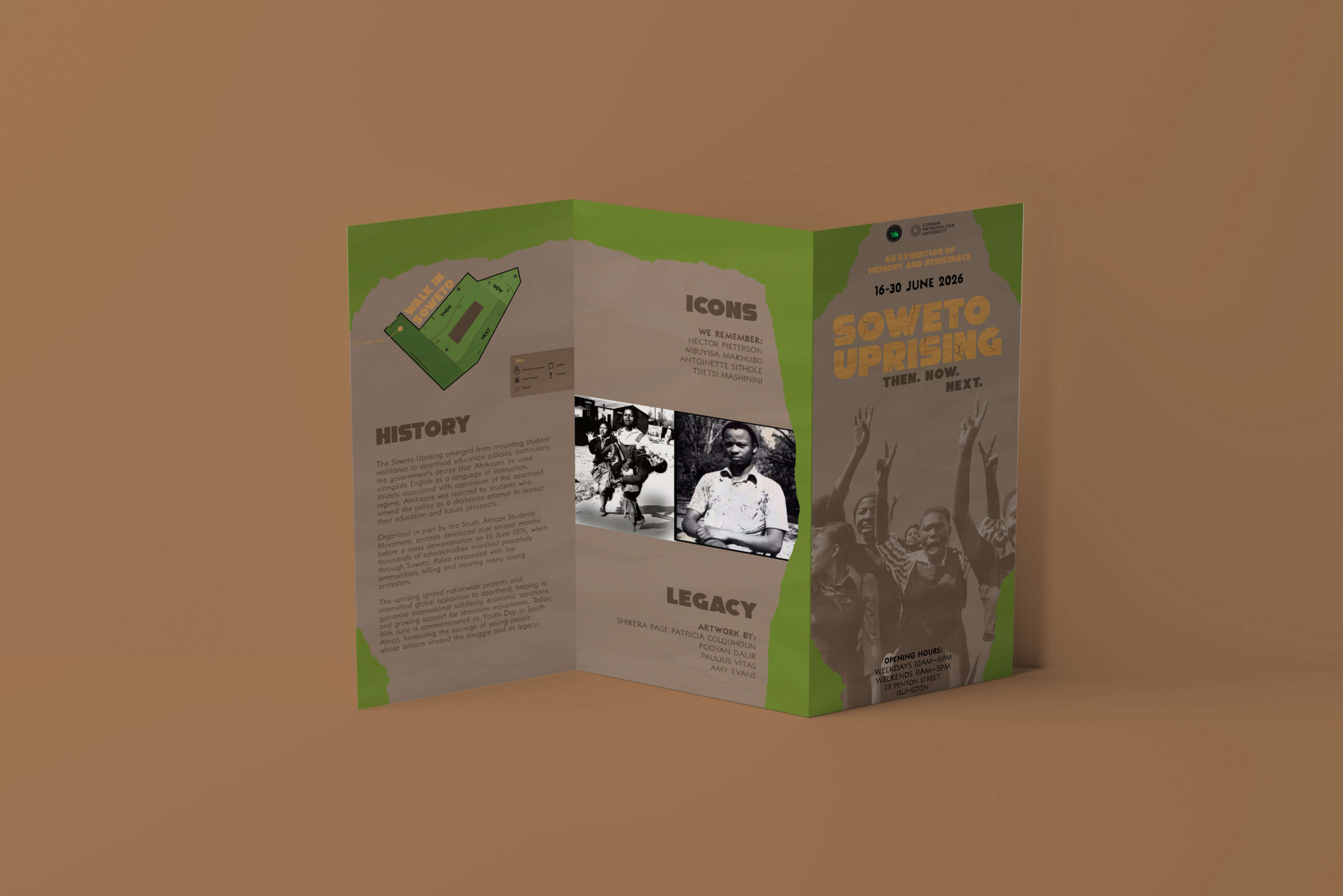
Z-Fold leaflet mock up, drawing on archival photographs by South African photographers including Peter Magubane and Sam Nzima to support further learning and reflection on the events of 16 June 1976 (further references drawn from PLP Archive).
Materials
To reflect the rising tension of the uprising, I used textures such as scrunched paper and cracks throughout the exhibition. These materials convey harshness, disruption and the lasting marks left by the events of 16 June 1976. The crack textures, in particular, help shape the atmosphere of the space, creating a rough, grounded environment that reinforces both the physical landscape of Soweto and the emotional weight of the history being explored.
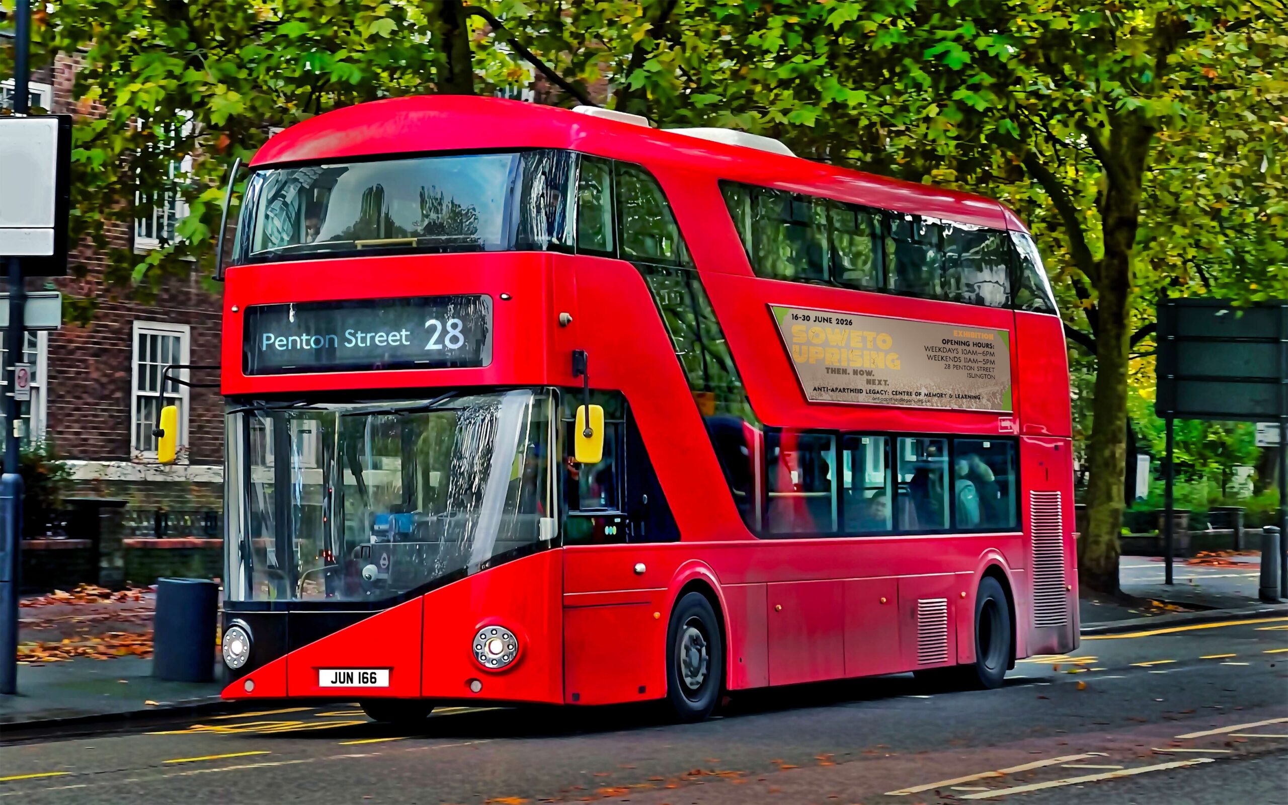
Bus advertisement mock-up showing how the exhibition identity could reach audiences in public space.
Reflection
This exhibition wasn’t just a simple project; it was a way of re-looking back at history and remembering the tragedy that shocked the world. The most challenging part of this project was making design choices that are appropriate to convey the serious and important topic of the Soweto Uprising, and finding engaging and appropriate ways to convey this to a young audience – an audience of the same age as those in the 1976 uprising – but whose own realities and life experiences may be entirely, or in part, different.
I took this challenge and illustrated my ideas and design process to create a finalised exhibition that would not only suit the target audience, but also engage a wider age group. It allows a wider participation and helps to re-introduce the topic to a new generation.
This project gave me a better understanding of exhibition spaces and how design can be used to communicate complex histories. It also helped me understand the importance of preserving stories such as the Soweto Uprising and making them accessible to new audiences.
Through this speculative exhibition, I wanted to create a space where young people could learn about the courage of the students who protested in 1976 and reflect on the role that young people continue to play in shaping society today. If visitors leave with a greater understanding of the uprising and feel inspired to think critically about fairness, equality and their own ability to create change, then the exhibition has achieved its purpose.
Being part of this collaboration between London Metropolitan University and the Anti-Apartheid Legacy Centre has been a meaningful experience that has helped me build new skills, strengthen existing ones, and expand the way I think as a designer. Working on a project connected to such an important part of South African and global history has been a real privilege.
Blog written by Jaydon Thamotharampillay, Graphic Design Level 5, London Metropolitan University, June 2026
Instagram: @j4ydesigns
Email: jaydonsabesan@gmail.com