
Walking Alongside History: Designing the Soweto Uprising for a new generation
A blog by Chloe Sibley, June 2026
Hi everyone! My name is Chloe Sibley and I am a Level 5 Undergraduate student from London Metropolitan University studying Graphic Design. As part of their partnership with the Anti-Apartheid Legacy Centre, my third project of Level 5 was to design exhibition graphics for a speculative exhibition about the Soweto Uprising to mark its 50th anniversary. We had creative freedom in terms of the design, but we were given a specified target audience of secondary school children (11 to 16 years old).
The Soweto Uprising was one of many acts of resistance during Apartheid, a period of time in South Africa where the white government in power enforced legislation that resulted in racial segregation and discrimination from 1948 til the early 1990’s. On 16 June 1976, thousands of Black school students in Soweto protested against apartheid education policies, including the enforced use of the Afrikaans language in schools. The peaceful march was met with police violence, resulting in many deaths and injuries and riots in the days that followed. The events became a turning point in the struggle against apartheid and continue to be commemorated in South Africa today.
What struck me the most at the start of the project was the target audience. The Soweto Uprising was a tragic and sensitive event, but it was also a powerful moment in history led by young people. The students who protested in Soweto were a similar age to the audience I was designing for, which made me think carefully about how contemporary young people might connect with their stories.
To inform my design decisions, I gathered feedback from people within the target age range. The responses highlighted how diverse the audience was, with younger and older students engaging with the topic in different ways. This reinforced the need for a design that was both accessible and engaging, while remaining respectful of the events being explored. A desire for interactive experiences emerged repeatedly and became a key part of my final concept.
Research and influences
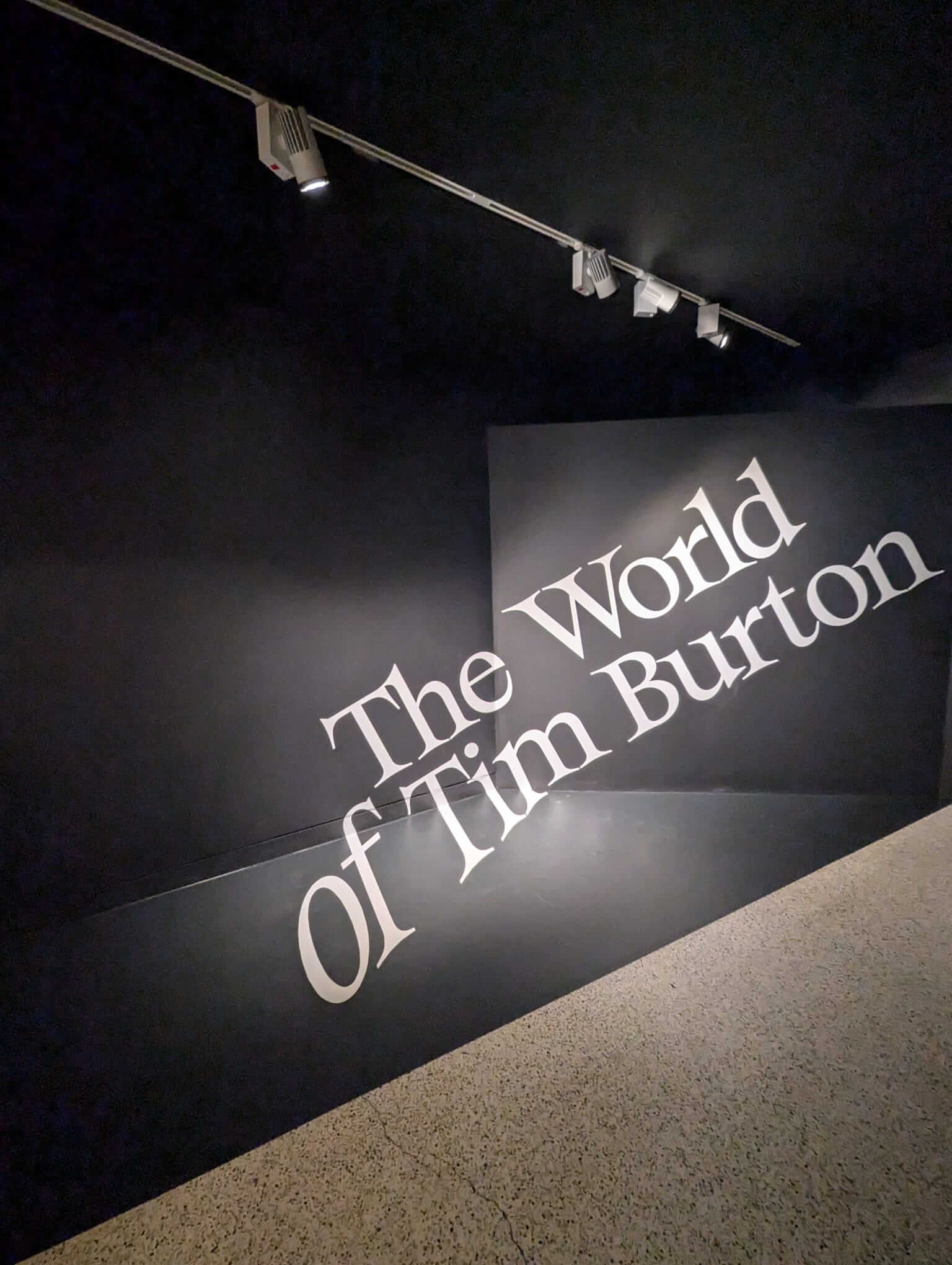
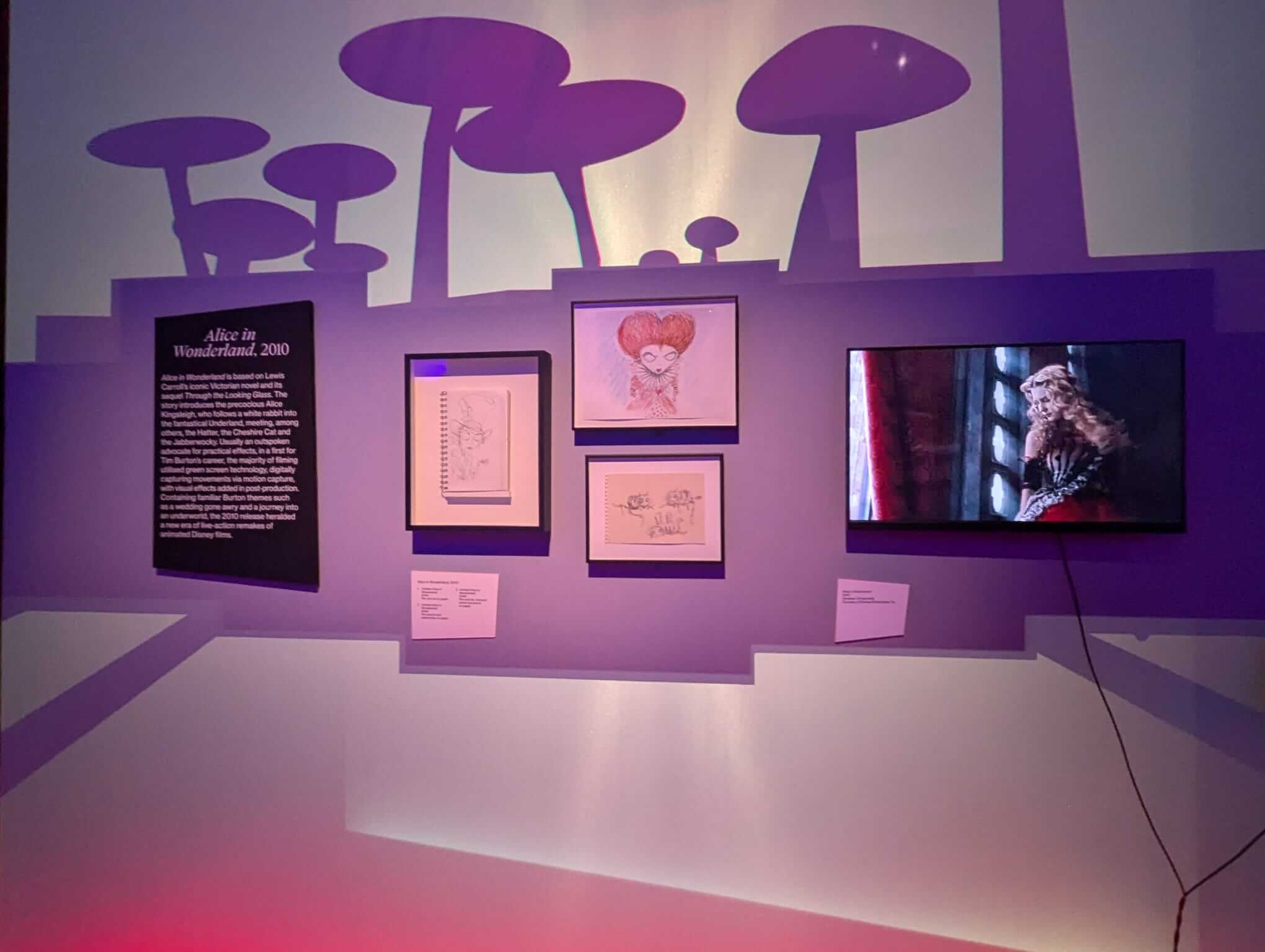
Photos I took at ‘The World Of Tim Burton’ exhibition at The Design Museum in London that ran from October 2024 to May 2025.
I started off this project by looking at various examples of exhibition design. For example, exhibition graphics from the ‘Inside Aardman’ exhibition at the Young V&A in London were playful and colourful, as were those of the Harry Potter Studios and Friends Experience, and the redesigned exhibition graphics from the ‘Wildlife Photographer Of The Year’ exhibition at the Natural History Museum in London were more simplistic and monotone. I found myself drawn to more playful looking exhibitions, which matches my typical style as a designer, but felt inappropriate for this project.
In the end, my main source of inspiration was ‘The World Of Tim Burton’ exhibition at The Design Museum in London that ran from October 2024 to May 2025. I’d seen this with my sister and I loved the whole experience; it was very uniquely designed and felt very ‘Tim Burton’. More than a year after my visit, I remained impacted by the idea of incorporating shadows into exhibition design which sparked my concept idea for this project.
Project Concept:
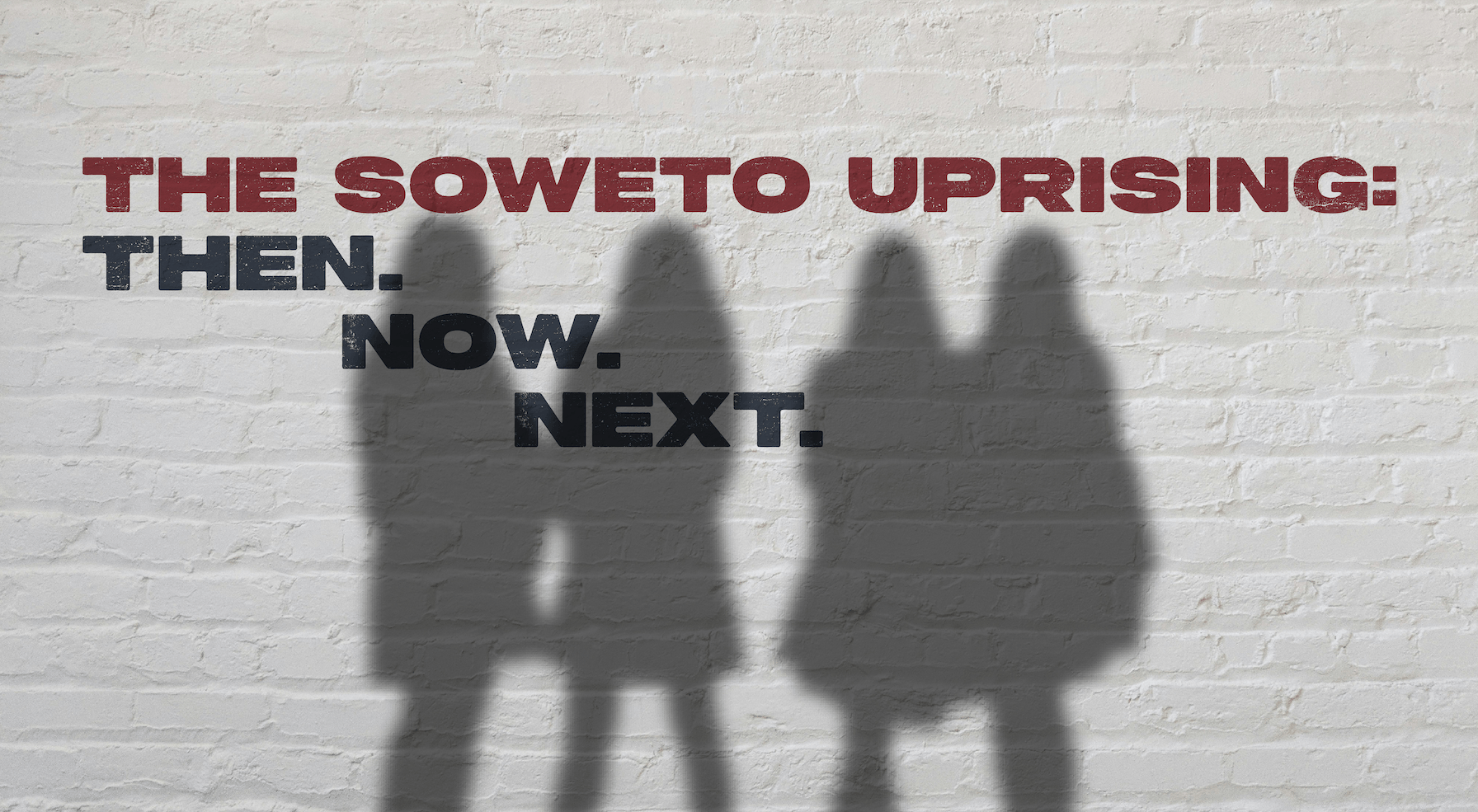
I wanted to introduce audience interactivity through the use of shadows. The idea was to create an exhibition with either projections or lighting placed strategically throughout the space so as the audience walked through the exhibition, their shadows would walk alongside them. This would invite the target audience, who were the same age as those who took part in the protest that we now call the Soweto Uprising, to walk alongside the protesters.
My overall vision of my exhibition was to use the physical space and materials by installing the work and text directly onto the walls to fully utilise the shadows and allow for readability. This would involve painting the title graphic and intro board directly onto a white wall, flyposting posters, printed work and captions onto the walls (to give the effect of them being flat on the wall and to allow for the wall texture to show through) and using projectors to play any animations or videos directly onto this surface.
Three key words drove my design. These were ‘immersive’, ‘shadowy’ and ‘atmospheric’. They all are fairly self explanatory, but the main idea was to design for an experience that transported the audience to Soweto and the time of the Uprising.
Colour and Typography:
My colour scheme initially had a focus of red with it just consisting of different shades of the one colour. I chose red because of its symbolism and the direct links that could be made to the Soweto Uprising; red is reflective of anger, which is what the students felt towards the enforcement of the Afrikaans Medium Decree which lead to the events of the Soweto Uprising, and symbolises the blood which was shed, as well as themes of revolution and liberation, which is what the citizens of South Africa were fighting for during Apartheid.
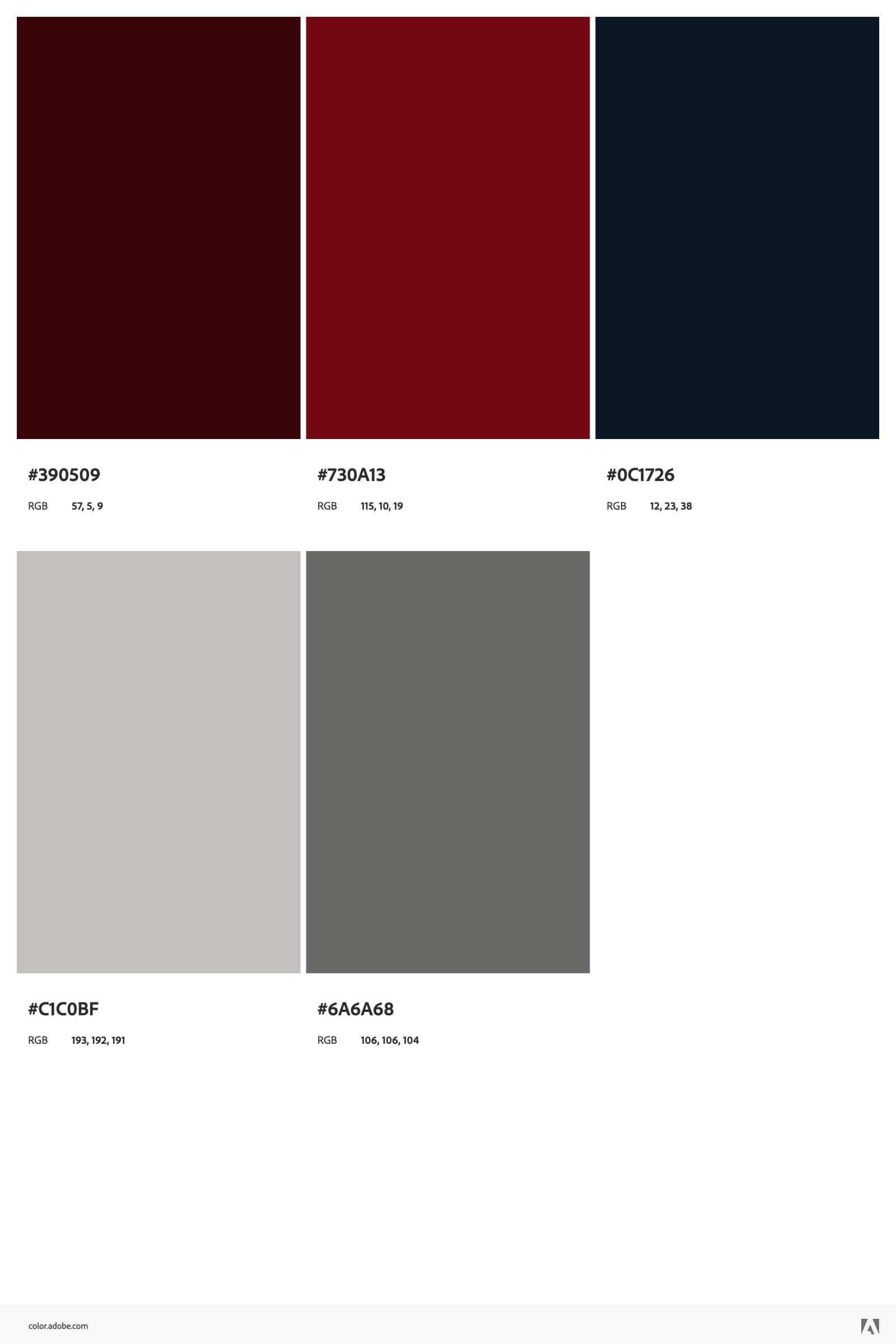
Colour Palette, Typesetting and Captions developed as part of the exhibition design process.
While the inclusion of red was praised by both my teachers and the representatives of the Anti-Apartheid Legacy during feedback sessions, it was pointed out that a contrasting colour would help elevate my concept. I chose a shade of navy blue as it paired very well with red and created a clear contrast. This is a colour pairing that is not seen often in Graphic Design and helped to create the sense of uniqueness that I was aiming for in my work.
With my concept materials focused on painting words onto walls, I needed to select typefaces that were bold and readable, especially in both strong lighting and shadows. I chose typefaces that are arguably simplistic, yet bold and which paired well together. My primary typeface was Peckham Press from the Ellen Luff Type Foundry, and my secondary typeface was Helvetica Neue from the Linotype Design Studio by Max Miedinger and Edouard Hoffmann.
Creating The Exhibition Design Assets:
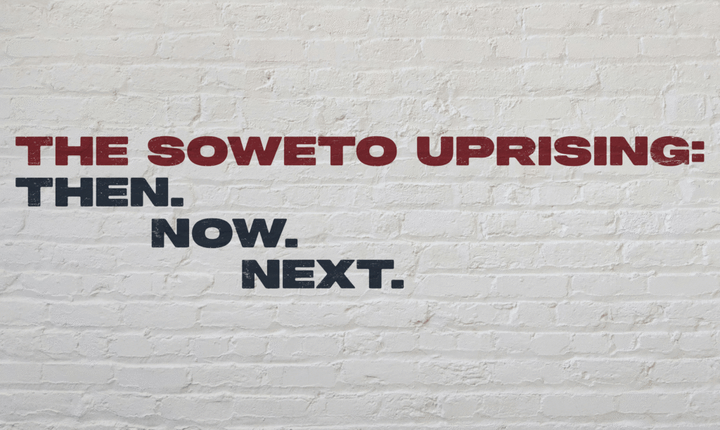
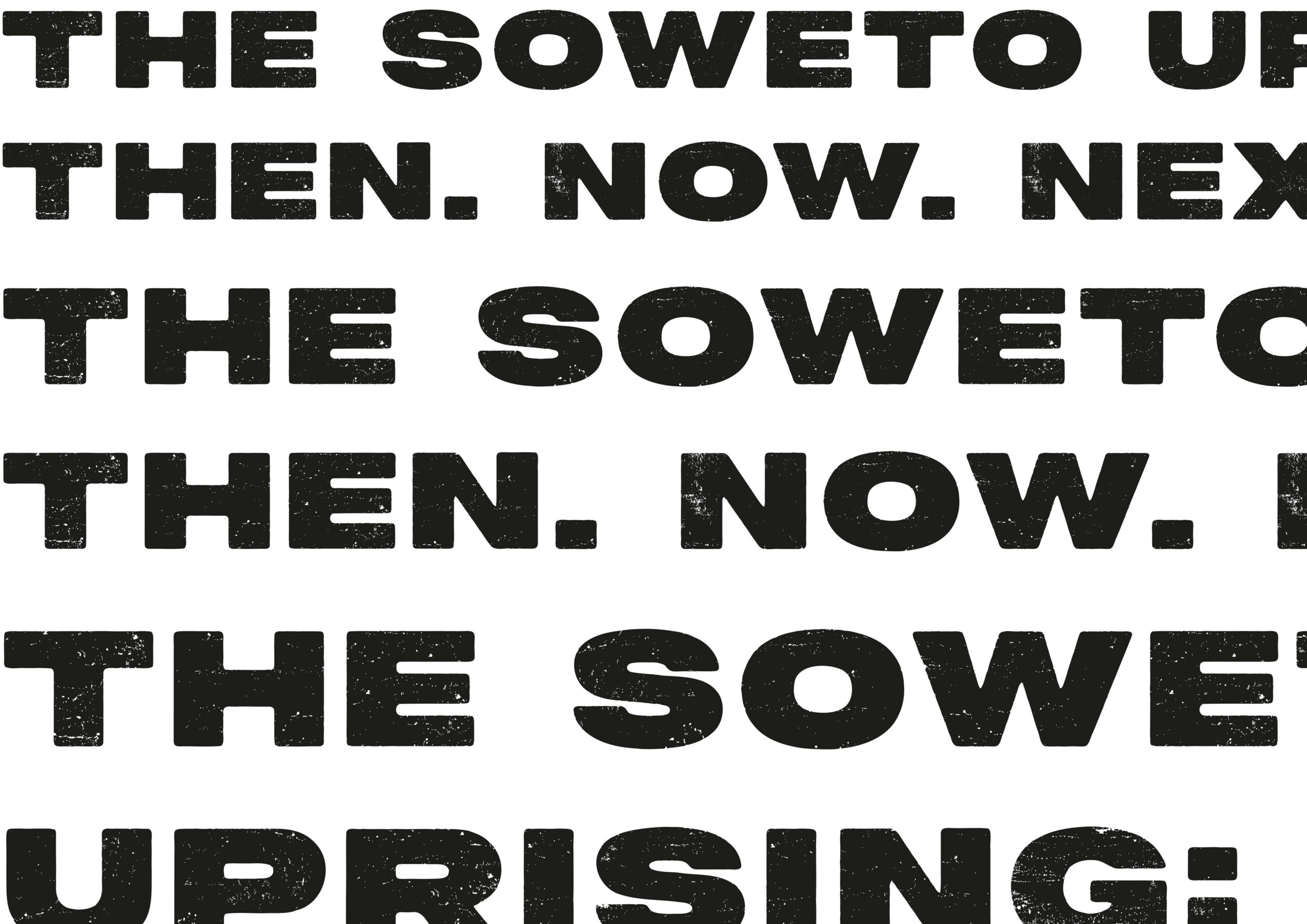
I started the production process by creating the title graphic, which would influence the style of the other assets I would create. When typing up the set exhibition title “The Soweto Uprising: Then. Now. Next.” I noticed that my primary typeface had a bold and rigid design with it only being available in capital letters. While this was very readable, I wanted to try and create a sense of flow within my typography to make it more unique, eye-catching and engaging for the target audiences. I decided that having the text staggered would keep the eye flowing seamlessly as you read the title and then created a contrast in the title by using both the red and navy blue.
For the exhibition intro board, I needed to find a way of incorporating a larger amount of smaller text into the design. In keeping with the idea of creating a visual flow in my design, I engineered the final full stop in the exhibit title and primary typeface as a bullet point to start off the first paragraph of text using my secondary typeface for the body copy text. This helped to create that seamless flow between the title and body copy text. I used the primary typeface full stop as a bullet point at the start of each paragraph to create a clear sense of cohesion.
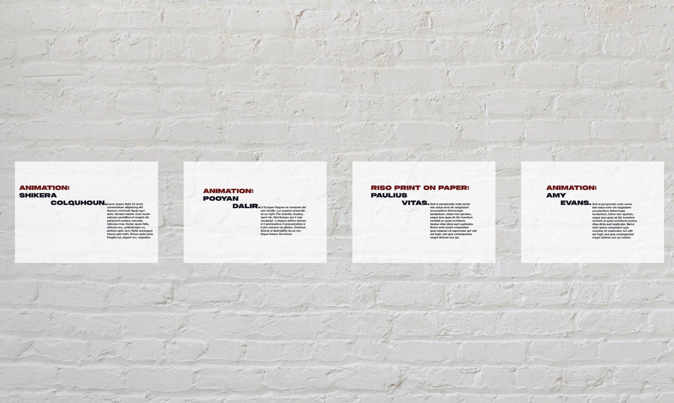
The final exhibition design asset was the captions for the work that would be displayed. I have to say the typesetting work for the body copy text of the captions was the hardest part of this process. Where the text was smaller, I had to work hard to ensure readability and balance in the design. I do think I achieved this in the end.
Creating The Other Project Deliverables:
We had to make a promotional poster for the exhibition and two social media posts for The Anti-Apartheid Legacy. For these deliverables, I wanted to create more photographic outcomes so that I could demonstrate and consolidate the other skills I have learnt throughout the academic year outside of typography.
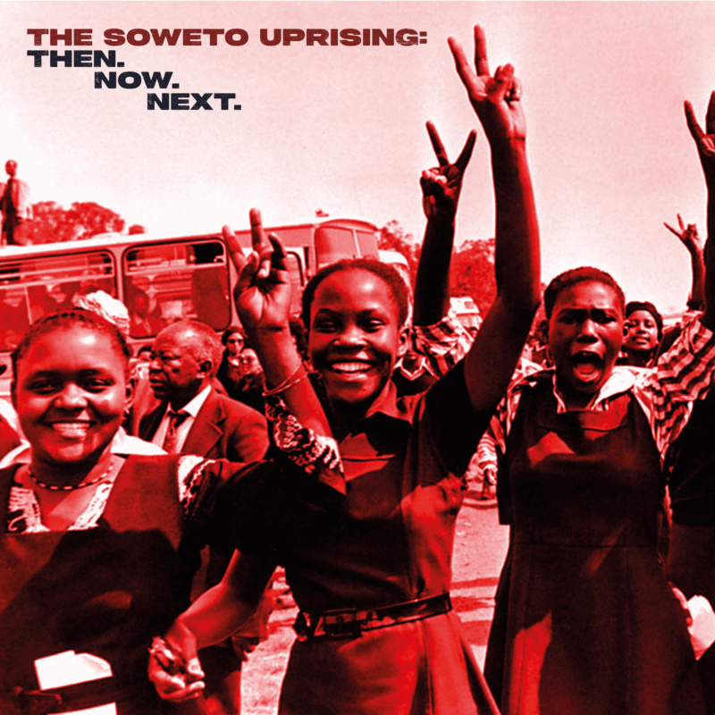
Social media post created speculatively for the project – responding to the Peter Magubane photograph that I was inspired by, and came across on this BBC Witness History piece ‘Soweto Uprising’. I also researched other photographic materials using the PLP archive.
I started by designing a promotional poster for the exhibition. I chose a photograph from the Soweto Uprising by Peter Magubane (used as a cover photo for a BBC History Witness oral history I listened to as part of my research) that showed students demonstrating a sense of optimism and collective action. As the poster was intended for public display, I wanted the imagery to be suitable for a wide audience while still reflecting the significance of the events being explored. I adapted the image to align with my colour palette and incorporated the exhibition title and key visitor information, ensuring the design remained consistent with the wider exhibition graphics.
I created speculative social media posts, including an Instagram style post with the aim to reach the parents and teachers of the target audience as research showed that it was these people who commonly use Instagram as a social media platform. I used a similar photo editing process as my poster to keep the colour scheme consistent throughout.
For my final social media outcome, I wanted to engage the target audience directly. Audience research highlighted YouTube as a popular platform across the age range, so I created a short educational video combining archival photographs and text to introduce the history of the Soweto Uprising in an accessible and engaging way.
Example of educational video that I created for social channels – drawing on photographic materials in research undertaken, including using the PLP archive.
Final Reflection On The Project:
This project was challenging in many ways, but the most prominent challenge for me was the responsibility of appropriately displaying such tragic events to an arguably sensitive target audience. Nearly all of my previous university projects have been lighthearted and playful so jumping into a project with a more serious subject matter was a tricky transition. I felt an obligation to get this right and create designs that reflected the tragic and serious themes, whilst conveying a sense of purpose that resonates even now. Working closely with The Anti-Apartheid Legacy and my tutor helped to alleviate some of the anxieties I had around this, and I think my final outcomes reflect me overcoming this challenge.
My concept aimed to create a sense of empathy within the target audience with those who took part in the Soweto Uprising. By putting the audience in the theoretical shoes of those who partook in the Soweto Uprising by walking with their shadows, I wanted to create an experience in which the audience would gain an understanding of what the Soweto students went through. I believe that understanding comes from empathy, and in order to prevent such atrocities from happening in the future it is important to understand the past and empathise with the experience of those who came before us.
One of the things I learned through the project was that the Soweto Uprising is not only a historical event. The students involved were young people whose actions helped shape the future of their country. Designing for a contemporary audience encouraged me to think about how young people today can engage with histories of protest, democracy and social change, and what they might learn from them.
The exhibit is called “The Soweto Uprising: Then. Now. Next.” and in order to protect the “Next”, we must understand the “Then” in order to implement the societal changes in the “Now” to safeguard the future and ensure such tragic events do not happen again.
Blog written by Chloe Sibley, Graphic Design Level 5, London Metropolitan University, June 2026
Instagram: chloe_does_graphic_design
Email: chloesibley7@gmail.com