Resilient Roots
A blog by Declan Munro.
My name is Declan, and I’m a recent MA graduate in Visual Communication: Graphic Design from London Metropolitan University. One of the most impactful projects I worked on during my studies was the Resilient Roots Project, a live brief focused on raising awareness of South African plants in the Chelsea Physic Garden collection. We were invited to create new visual responses which would both enable visitors to the garden to learn about the plants’ indigenous contexts, usages and symbolism.
This project was led by our course coordinator, Angharad Lewis, in collaboration with The Liliesleaf Trust’s Anti-Apartheid Legacy team and the Chelsea Physic Garden (CPG). Guided by Caroline and Nadia from Anti-Apartheid Legacy with Shivani and Frances from CPG, and elders from the South African diaspora in London, we explored the intertwined histories and traditional usages of these plants as well as their symbolism in the context of the fight against apartheid. Our task was to reframe botanical and colonial representations for a contemporary audience, while highlighting themes of resilience and survival embodied in these plants.
What began as an academic exercise soon became a deeply emotional journey, bridging history, culture, and nature through design—an experience that affected me profoundly.
Immersion in the Garden, Archives, and Community Stories
The journey began with visits to the Chelsea Physic Garden, where we explored the newly renovated glasshouses housing South African plants. These plants weren’t just biological specimens—they were living symbols of struggle and survival. Understanding their growing conditions, how they were collected and transported, and their dual naming revealed the depth of their historical significance.
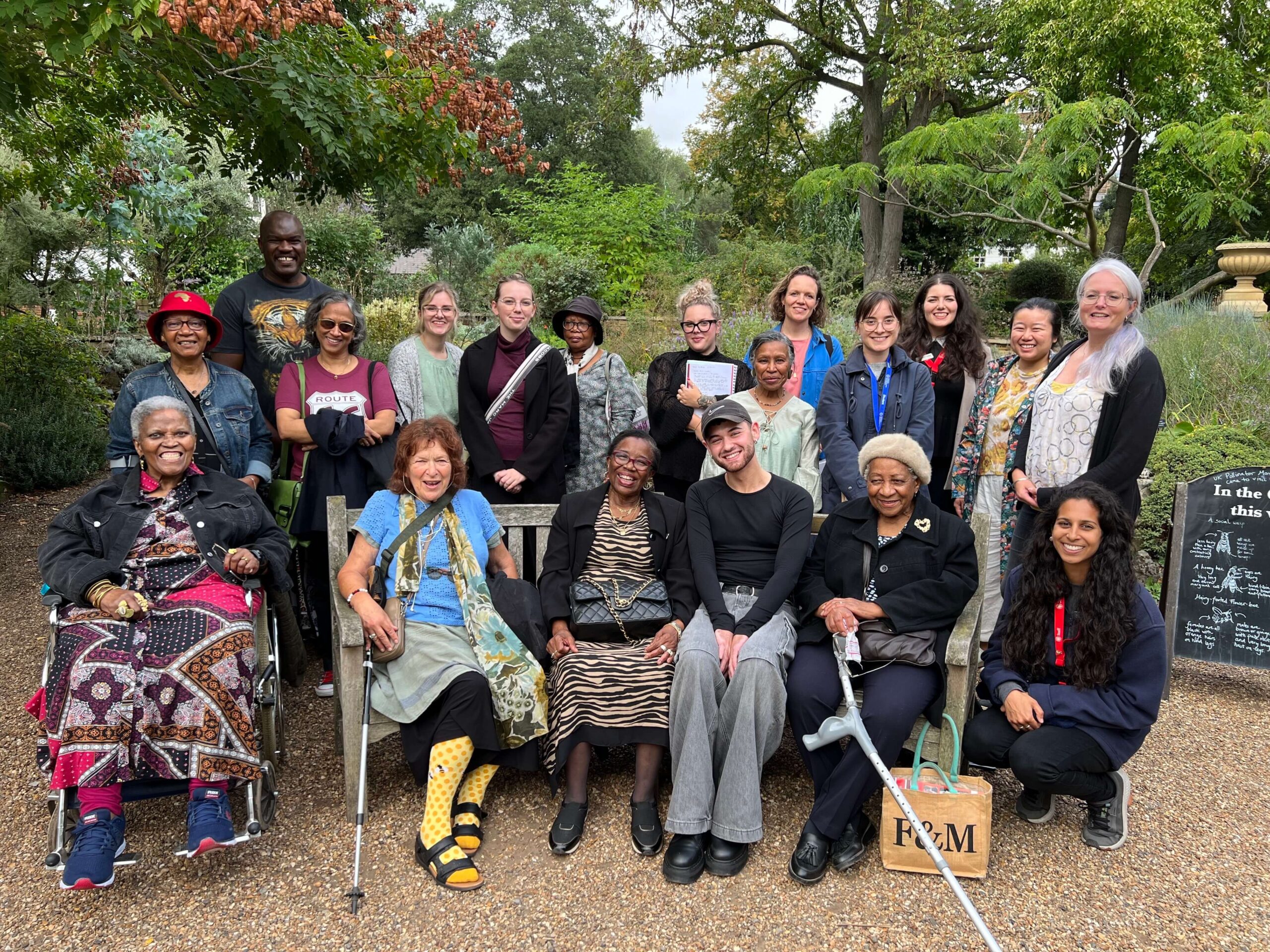
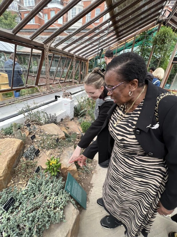
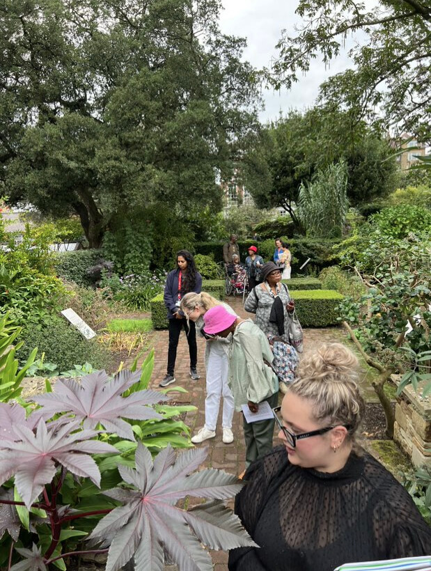
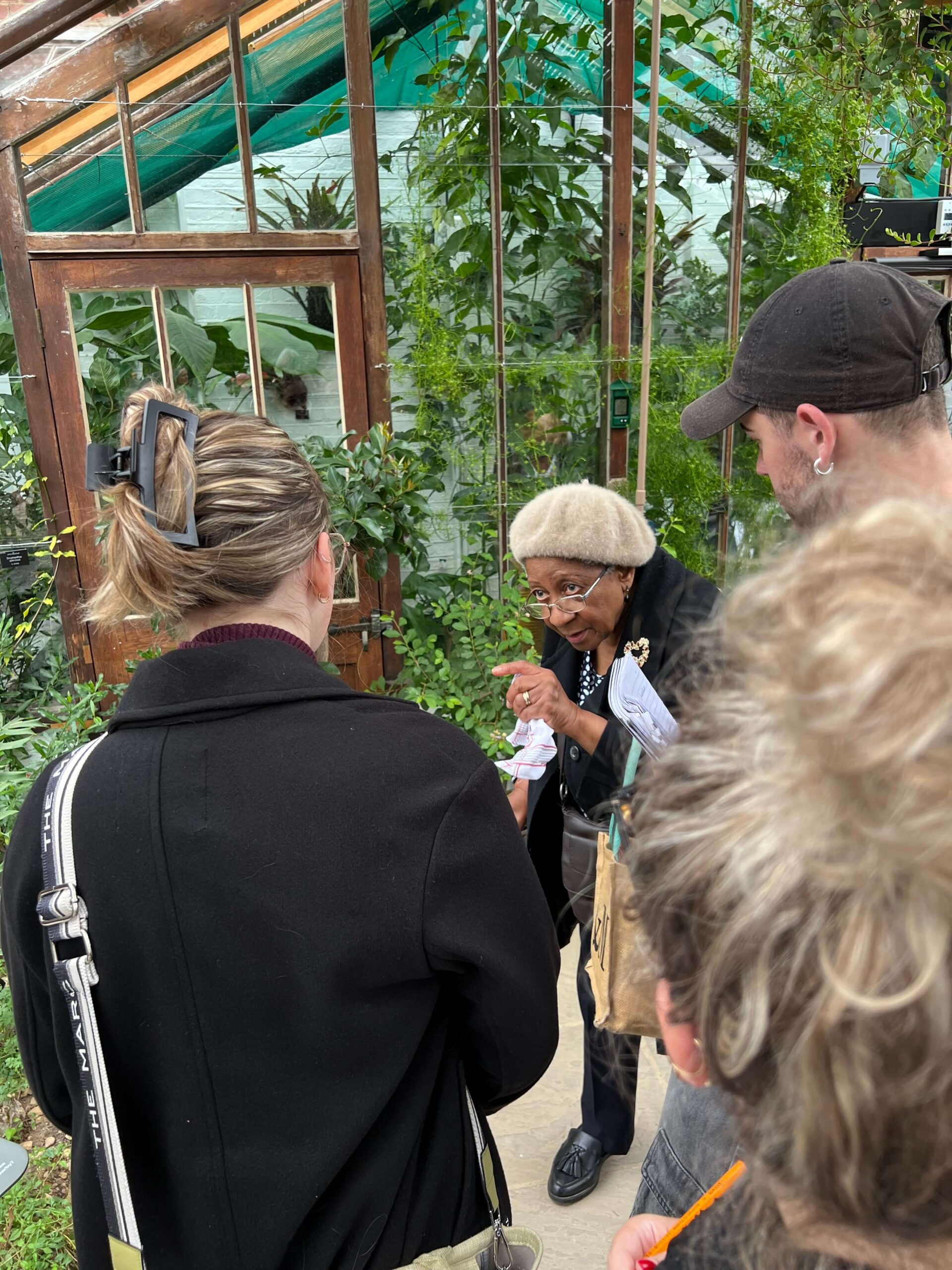
I also had the privilege of meeting a group of South African elders in London, brought together by Anti-Apartheid Legacy, and we took a walk through the garden together. They shared their vast knowledge of plants, many of which were used medicinally, along with deeply personal stories of life in South Africa, their migration, and their experiences in London. Their narratives connected the plants to the cultural struggle against apartheid, helping me understand how these plants became symbols of resilience and community. These stories, which we heard from the elders both at the garden and in several follow on sessions held at London Met Uni, highlighted how design could preserve these histories and amplify voices that often remain unheard. Discussions with South African elders revealed that many traditional healing practices have gradually disappeared. Once vital for combating diseases and creating self-connection and healing, these plants represent a way of life deeply rooted in cultural heritage. The study of Ukuthwasa by Livingstone Mqotsi, with contributions from his widow Iris Mqotsi, was instrumental in shedding light on the medicinal qualities of these plants.
Images showing the elders and the students in the garden.
To deepen my understanding of the project’s context, I conducted research at London Metropolitan University’s Special Collections, specifically the Trades Union Congress Archive. This archive contained materials on apartheid-era South Africa and the global Anti-Apartheid movement, providing critical insights into the migration of South Africans to London and the systemic injustices they faced.
This combination of botanical exploration, personal stories, and historical research allowed me to create visual narratives that connected plants to the people they represented. It was a powerful learning experience that highlighted the importance of storytelling in design.
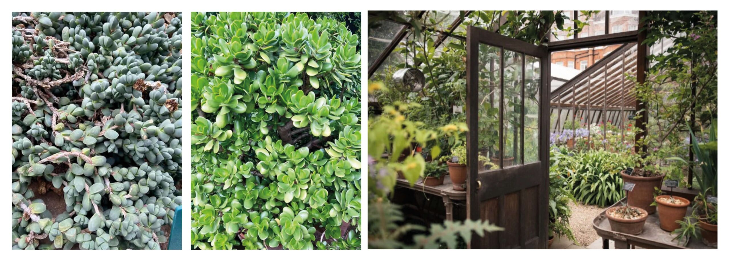
To connect the plants with their symbolism, I explored their forms through personal photography and revisits to the Chelsea Physic Garden, capturing unique angles and qualities. These observations informed my artistic direction, helping me transition from traditional botanical realism to a more abstract style that better conveyed the plants’ deeper meanings. I reimagined the plants as highly stylised, characterful depictions.
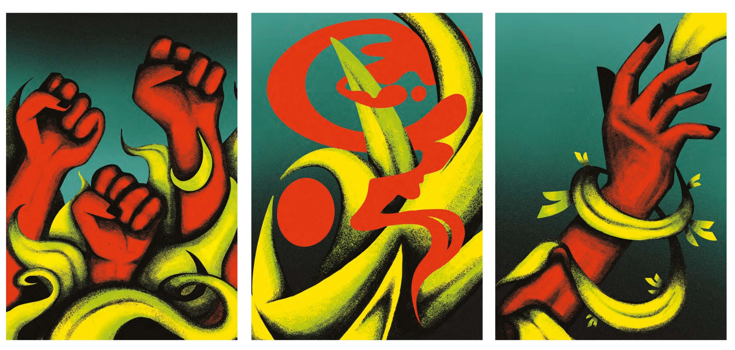
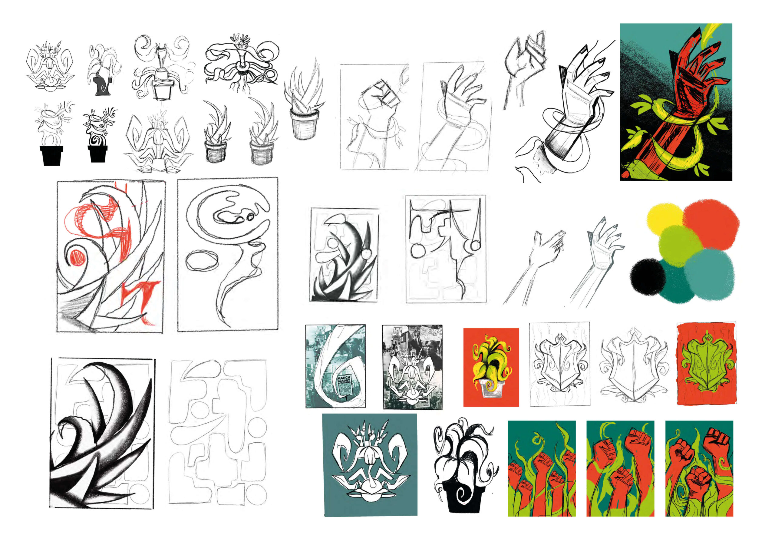
An iterative process was fundamental to this exploration. Quick sketches allowed me to experiment with angles and themes, and multiple variations helped refine each concept into cohesive designs. Texture was central to the final outcomes—gradient stipple brushes added depth and ensured the images felt dynamic rather than flat. I developed a limited colour palette of greens, yellows, and teals to emphasise the plants’ natural qualities, with vibrant red providing a striking contrast to underscore their symbolic messages.
This iterative, hands-on approach to both style and content enabled me to craft a unified visual language across the posters, ensuring that each design resonated with the same depth and thoughtfulness.
Exploring the chosen plants
As I immersed myself in the plants of the Chelsea Physic Garden and the stories of the South African diaspora, I began to see how deeply history, culture, and nature were intertwined. The plants weren’t just specimens; they represented hardship, survival, and resilience, each with its own story.
After numerous group sessions and visual exploration, I selected three plants—one for each poster. The Welwitschia mirabilis, renowned for its ability to survive extreme conditions, became a symbol of resilience. Its long lifespan and endurance in harsh environments mirrored the ongoing fight for justice and equality. Further research revealed that the Welwitschia appears on the Namibian coat of arms, symbolising the reclamation of power and justice once denied to the people of South Africa.The Aloe aculeata, with its healing sap, symbolised recovery and hope—both physical and emotional. It became a symbol of healing from the wounds of apartheid, mentally and physically, as shared by many of the elders I spoke with. Finally, the Kedrostis africana, with its climbing vines, represented growth and progress, symbolising the ongoing journey to adapt and create change.

Presentation to peers, discussing findings
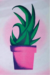
Aloe aculeata (Risograph Mockup)
Creative Process
In translating these powerful metaphors into my designs, I consciously chose to work without text. I wanted the plants and their symbolism to speak for themselves, transcending language barriers and connecting on a universal emotional level. I aimed to create striking imagery that provoked thought—hence my use of red. This was a deliberate choice to highlight uncomfortable truths and raise awareness.
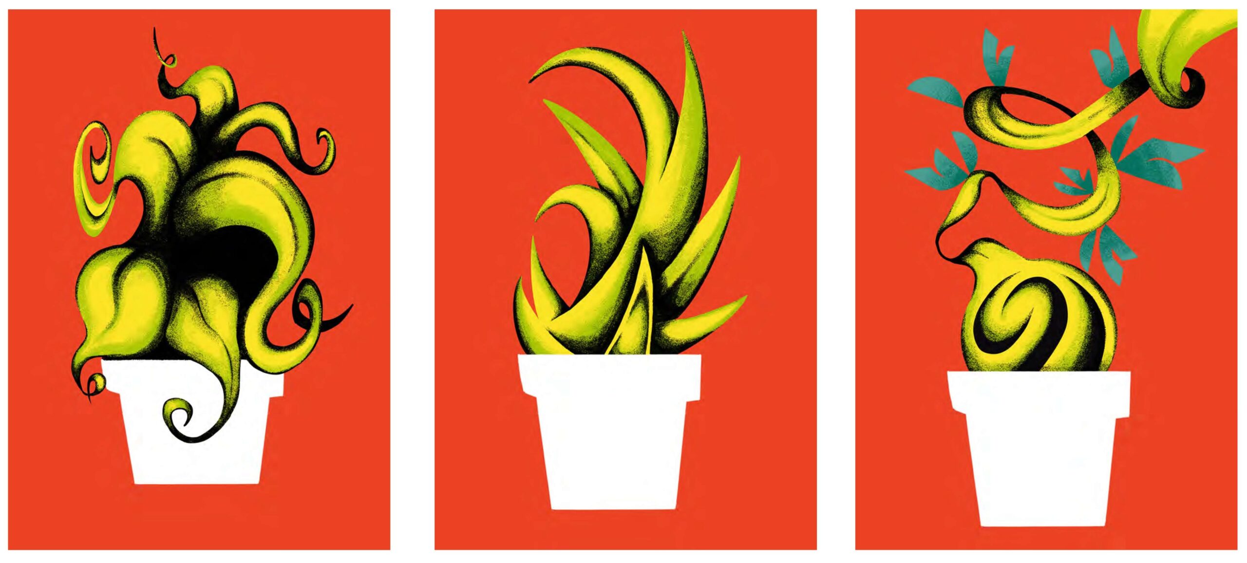
Final Posters (Left To Right): Resilience, Healing & Growth
- Resilience: The Welwitschia mirabilis, often called “two leaves never die” in Afrikaans, symbolises resilience in the face of adversity. I paired the plant with uplifted fists, a symbol of protest and resistance, synonymous with movements like BLM. The use of red underscores the assertiveness of the message, evoking urgency and power in unity.
- Healing: The Aloe aculeata’s healing properties, particularly its sap, are significant in representing the healing of both physical and emotional wounds. The depiction of blood in the design represents the ancestral knowledge of medicinal practices passed down through generations, while also reminding us of the ongoing struggles for justice.
- Growth: The Kedrostis africana is depicted with a hand intertwined in its vines, symbolising both the diaspora’s ongoing journey toward progress and the hope for change. The plant’s adaptability and growth reflects the importance of passing knowledge to future generations.
How the Project Shaped My Growth as a Designer
The Resilient Roots Project wasn’t just about creating beautiful designs—it was about telling an important, deeply emotional story. This project pushed me to grow not only as a designer but also as a storyteller. It taught me the importance of empathy and sensitivity when representing histories of trauma and resilience. I learned how powerful design can be in communicating complex and emotional themes.
Seeing people’s reactions to the designs and hearing their discussions about survival, healing, and resistance showed me the profound impact design can have. I’m already applying this valuable lesson in my professional practice, using creativity as a tool to amplify voices that deserve to be heard and to preserve stories that might otherwise be forgotten. You can see this approach reflected in my work on Instagram: @d.munro.design or contact me at declanmunro.work@gmail.com. This experience has not only shaped me as a designer but also reinforced my commitment to using creativity as a tool for awareness and change.
Written by Declan Munro, December 2024.
Project Collaborators
MA Visual Communication students
Declan Munro
Ada Murati
Rebecca Tosoni
Tea Marie Sudland Thjømøe
Tutors
Angharad Lewis
Finn Kidd
With special thanks to—
Nthabiseng Faku-Juqula
Theodora Mannie
Vusi Mathebula
Sara Mokone
Iris Mqotsi
Lindiwe Poswa
Jenni Sweet
Maria Segwai
With thanks for support to—
Connor Butler
Jeff Howarth
Nadia Joseph
Caroline Kamana
Shivani Patel
Frances Sampayo


