I’m Chiara, a level 5 student of Graphic Design at London Metropolitan University. To support every semester’s studies, our tutors tailor interesting and stimulating course briefs for us to respond to which enable us to develop our graphic design skills and, in some instances, offer the opportunity to gain industry facing valuable experience.
For the semester that began in January 2024, we were challenged with a ‘live brief’ as part of a work-based learning module. We were introduced to Caroline and Nadia from The Anti-Apartheid Legacy Team who in turn introduced the heritage of South Africa and the struggle against apartheid to us. For some of us students it was the first introduction to this history, for others it was a re-introduction or a deeper dive.
2024 marks the 30th anniversary of democracy in South Africa, and it was the journey to democracy and culminating in all South Africans finally being able to vote in their own country’s elections that inspired this brief set by Anti-Apartheid Legacy, in collaboration with our course tutors. They challenged us to design a speculative exhibition to be held at a fitting and significant place for the 30th anniversary, this would be at Constitution Hill (Johannesburg, South Africa), in a space within the former Women’s Jail. The team at Anti-Apartheid Legacy are collaborating with Constitution Hill on heritage and community engagement projects.
The title of this exhibition was to be “30 years of Democracy! in South Africa”. As part of our brief we received a copy for an intro panel, a supporting panel and a selection of artworks. We were tasked to layout the exhibition with the space in mind, choosing fitting graphics and settings to display the artworks, create caption boards and a complementary printed exhibition publication.
I enjoyed this project because it allowed me to learn more in-depth about such an important chapter of history. Working with this topic was not easy, I tried my best to be sensitive and respectful.
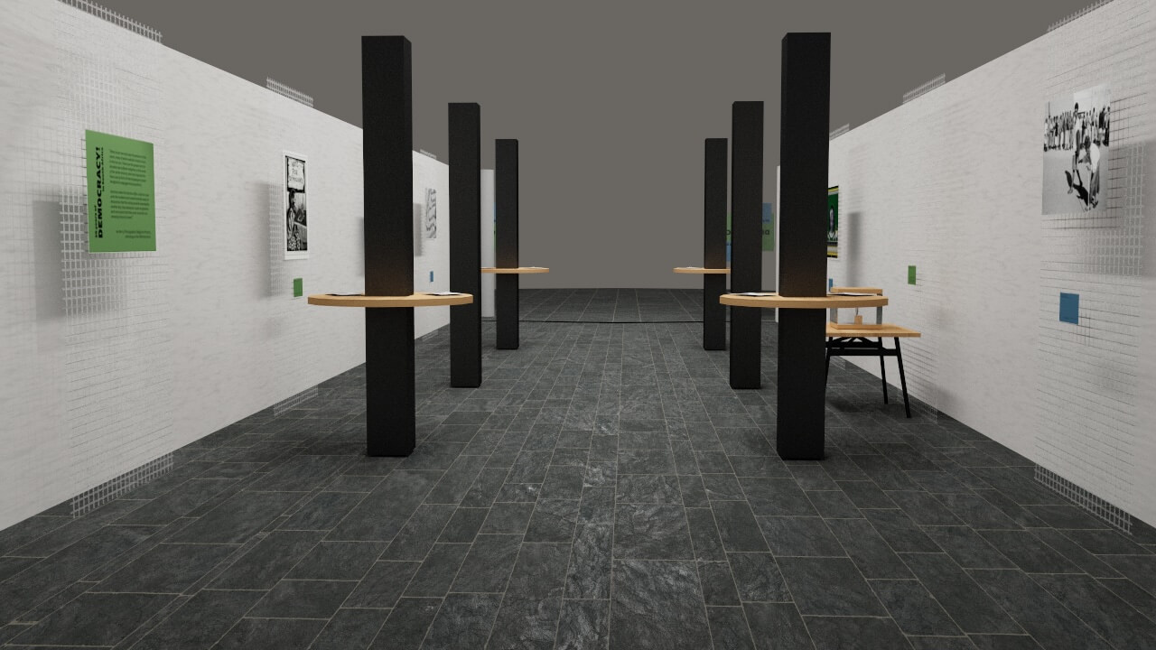
I developed my concept keeping in mind that the location for this exhibition would have been Constitution Hill, a place where history has been written, where even the walls can tell a story. We were supplied with the floor plans for the site in order to visualise the space. The Women’s jail is now a part of a museum for learning about the past and where visitors are encouraged to think about what learning about the past means for today and for the future.
Because of this, I realised that it was important that my graphics should not cover the essence and heritage of the room, so I used a metal mesh on which to place the captions – metal to represent the physical history of the prison space but with transparency to allow the walls to continue to tell their story. Proposing to use the metal mesh within an ex-prison has a certain emotional weight so to balance this, I decided to use light, coloured paper on wooden backing for the captions using bright yet not overwhelming colour palette, with wooden reading posts mounted around the central columns in the room. I drew on colour theory to make my palette choices; blue represents calm, security, serenity, endless opportunity, and blue sky. Green represents optimism, healing, hope, restored balance, nature, and fertility.
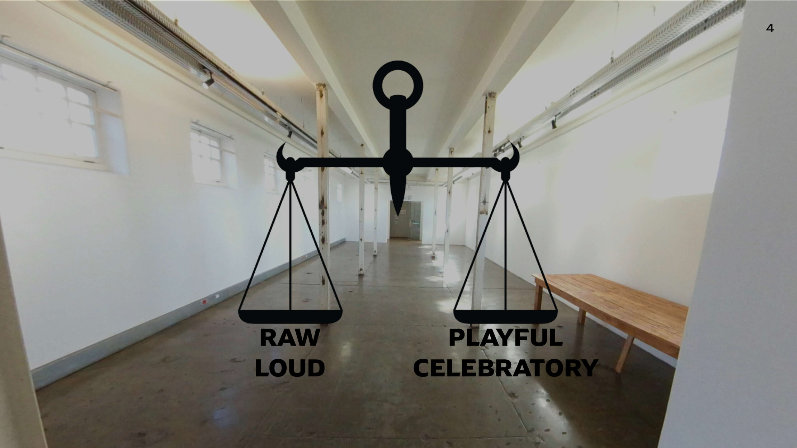
Screenshot from virtual tour of Constitution Hill, showing the exhibition space, with my key words chosen to guide design choices, superimposed on top.
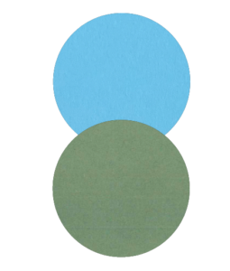
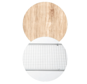
Colours and materials palettes.

Exhibition panel design
Typography research
The exclamation mark is very important to the title because it shows emphasis and strength of the topic. In this case, we can see how it resembles a spear, reminding us of the Spear of the Nation (uMkhonto we Sizwe), one of the tools of the struggle, co-founded by Nelson Mandela. As part of my research I explored further into the heritage through looking at physical and digital archives relating to the history.
To balance the emotional weight of this struggle history, I have decided that the graphics should contain a playful element since the anniversary is also celebrating the huge achievement of victory against apartheid for South Africa, a freedom celebrated across the whole world. To do so, I choose to play with my layouts by alternating left and right arrangements of text and also playing with the overlapping sheets of paper in the caption panels.
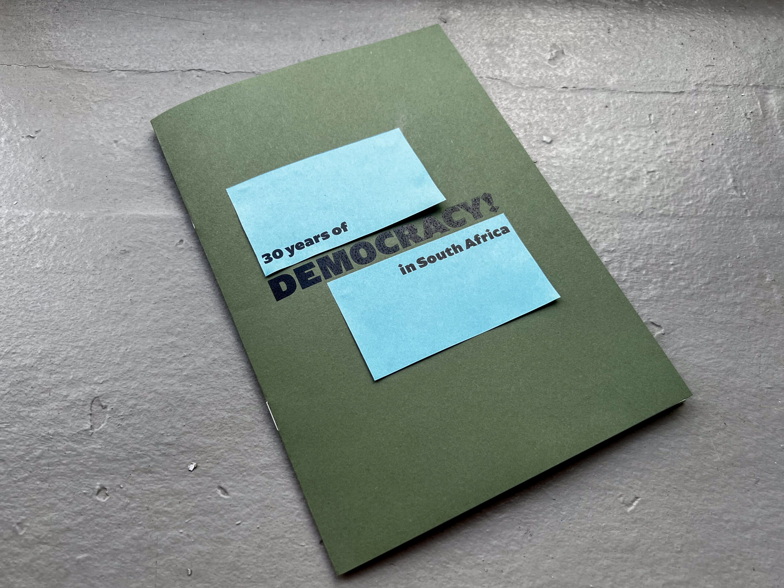
This concept ran throughout all of my graphics, including the accompanying publication which reproduces the title graphic reproduced on its cover and which hosts an interactive section with all the artworks displayed that, once flicked through, can be opened revealing a map of their placement within the exhibition space.
The choice of the paper was not random but had a meaning itself, too. I chose 136gsm paper for the cover, 80gsm paper for the middle section, and finally a cream 100gsm paper for the copy. The green and blue papers perfectly matched my concept, being of very soft shades. The cream one worked great because it gave a sense of warmth to the publication and had a texture. In fact, the green and blue papers are plain and smooth and, in contrast, I chose a third textured paper to complement them. This, specifically, had a texture that reminded me of vintage graph paper, and I thought that it could work well for my purpose.
On the left, Introduction Panel. Middle, Supporting Panel. On the Right, Example Caption.
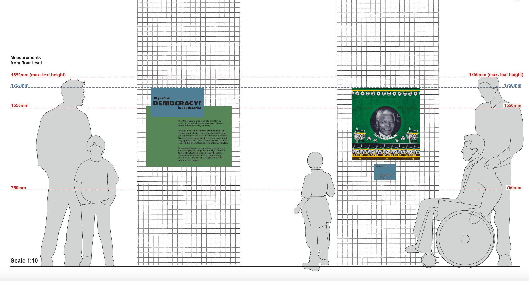
Designing to scale
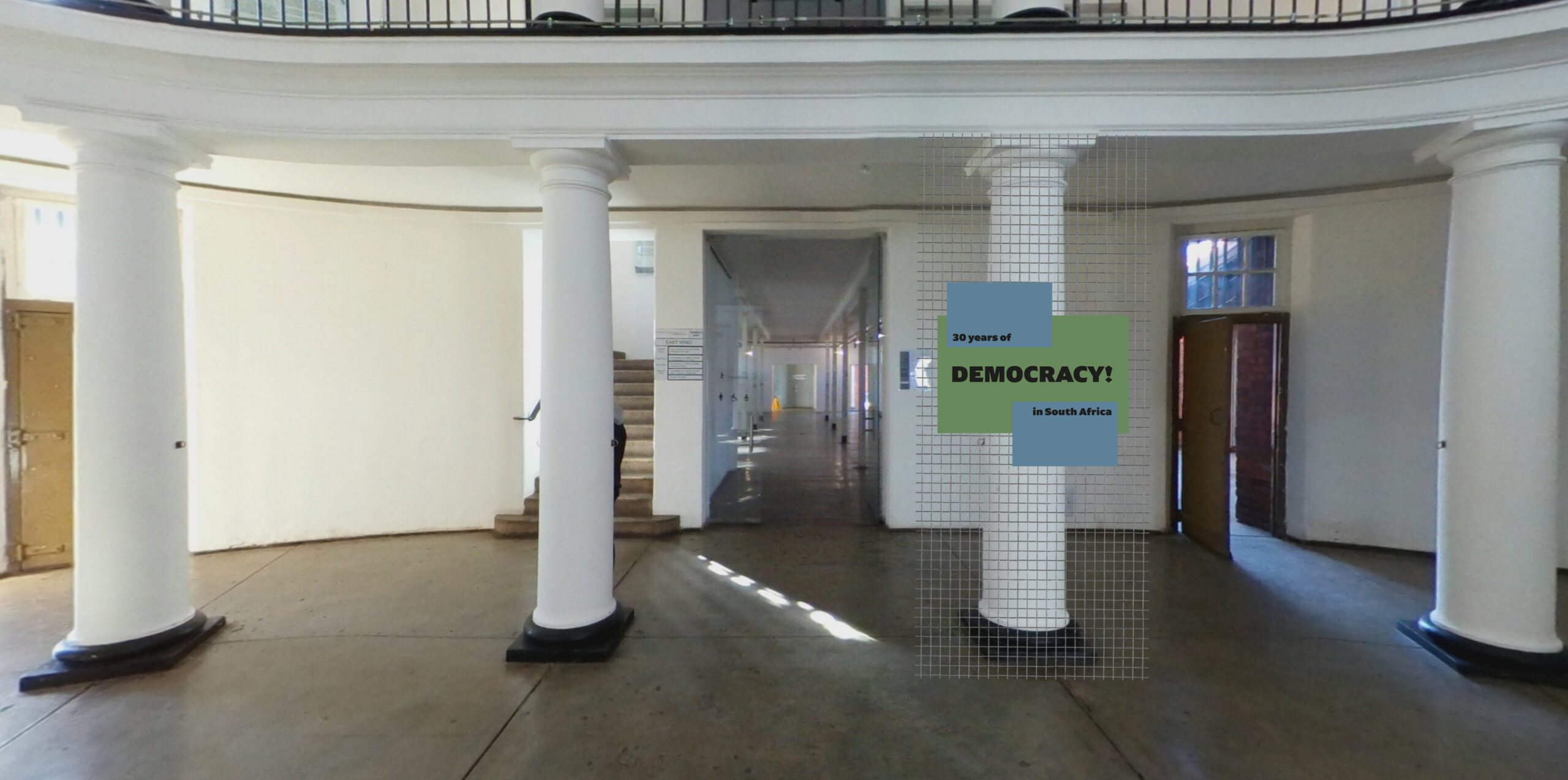
Mock-up of the exhibition entrance
In conclusion, working on this project not only enriched the development of many technical skills, it equipped me to deal with a real client, but also to understand how to use design to both respond appropriately to a subject matter and to engage audiences. Learning and delving into this chapter of history elevated my understanding of and attention to dealing with sensitive issues even in the workplace, helping me to shape and build my work ethic as well as invite others to engage deeply with this important history that continues to be so relevant today.
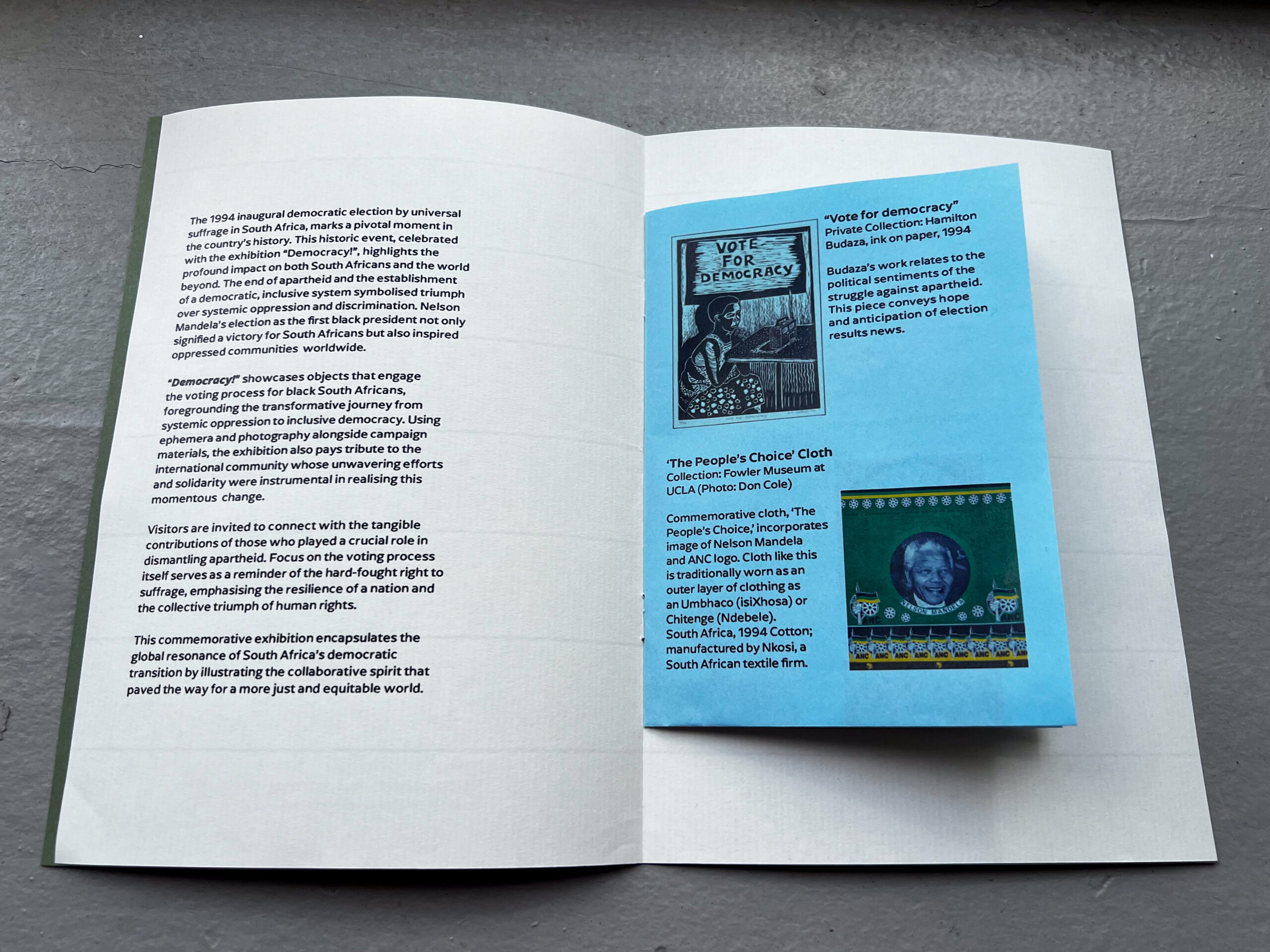
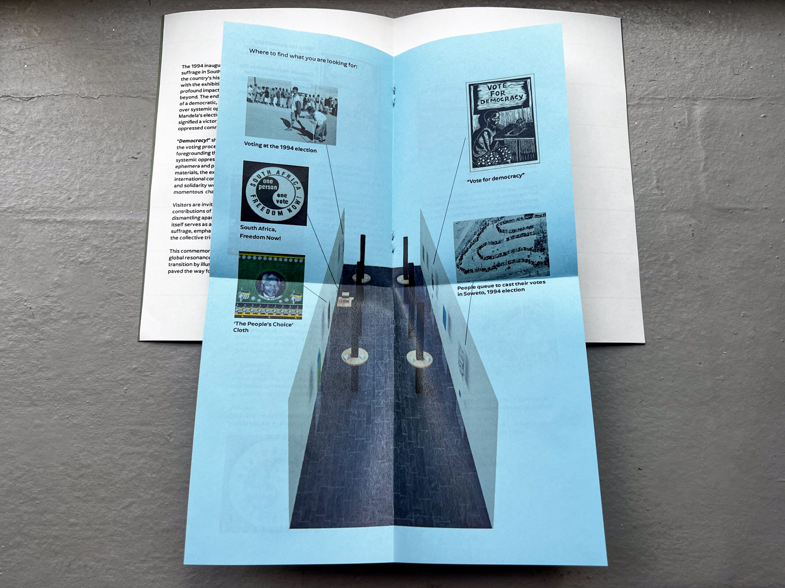
Mock up of printed publication to accompany the exhibition
Written by Chiara Montanarella (BA, Graphic Design), 2nd-year student at London Metropolitan University, May 2024